


It’s the tall, slim gateway to your landing page. And if you design it right, you may get your prospects to click through it. We’re talking about the commonly used display ad format, the skyscraper ad.
What is a skyscraper ad?
The skyscraper ad size comes in two dimensions: 120x600px and 160x600px. It gets its name from the tall, thin shape that makes it appear as a skyscraper compared to other ads.
That same shape is what makes it a little more difficult to advertise using the skyscraper format. There’s not much creative space in a skyscraper, and it’s a little more awkward to design in than a square or rectangle. It’s also a little easier for prospects to miss.
So, a great skyscraper has to be optimized for:
- Catchiness: Does it catch the eye?
- Clarity: Is the value proposition clear?
- Clickability: Does it compel the viewer to click?
- Creativity: Does it stand out from all the boring ads on the internet?
To help you create your next skyscraper banner ad, we rounded up 30 skyscraper ads to critique the good and the bad, the pitfalls and successes. Take cues from the examples below.
30 Skyscraper ad examples
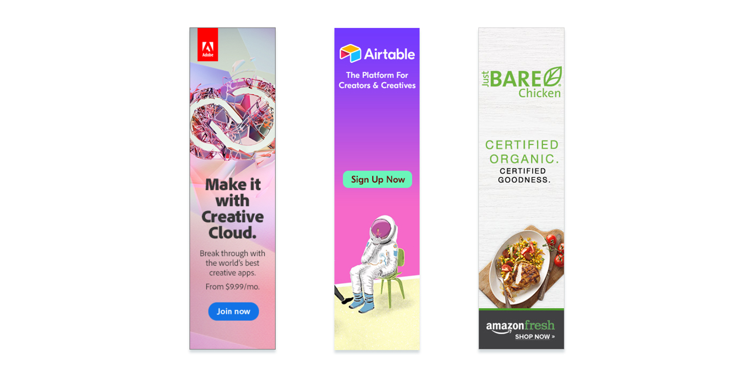

The pros: The Adobe ad is a color that will likely stand out against most page backgrounds, which draws the attention of those scrolling. The blue CTA button contrasts the background of the ad, so the visitor knows the it’s clickable. The logo identifies the product as Adobe. The low price indicates the surprising affordability of the Creative Cloud. For cons: the headline doesn’t much speak to the capabilities of the Creative Cloud, and the text refers to the products as “the world’s best creative apps.” It’s never a good idea to call yourself the best at anything. A quote from one of the many Adobe CC users would work great here.
In Airtable’s ad, the colors are attention-grabbing and the logo identifies the brand, but the CTA button is in the middle of the creative just above a drawing of an astronaut, which is the focal point of the ad. Since eyes move from top to bottom, what’s likely to happen here is people look right past the CTA button to the drawing. Notice that most ads here call visitors to action at the bottom of the ad, once all the creative has been absorbed visually. The major roadblock this ad faces though is its lack of clarity and appeal to self-interest. What’s Airtable? Why should we use it?
This next ad for Amazon Fresh draws attention to the product with brightly colored food and white space. The “Certified Organic” text is a big selling point for healthy eaters. The one thing this ad is missing: Why use Amazon Fresh? If the service delivers to your door, that’s a major selling point too. It should be emphasized here.
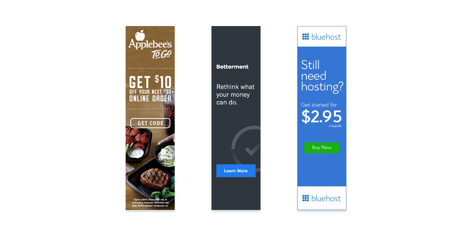

This first ad from Applebees exemplifies good visual hierarchy practices. The major benefit of claiming this offer — saving $10 — is written in the biggest text on the ad. Less important information is written in smaller text. The CTA is related to the offer and it’s easy to see. The food looks appetizing. Although, visitors may be concerned at the sight of fine print, (especially since it’s difficult to read). Why not put it on the landing page instead of the ad? Why not incorporate the expiration date into the copy to create urgency? Addressing these may boost click-through rates.
Unfortunately, this ad from Betterment doesn’t have much going for it. There’s nothing in it that really grabs your attention, and the text “Rethink what your money can do” doesn’t emphasize a clear benefit. Something like “You have more financial freedom than you think” might better convey Betterment’s ability to help viewers manage their finances.
Questions can make great headlines because they draw the reader in. That’s what this Bluehost ad does: Do you still need hosting? The text below in big type offers a very affordable option. But, “Buy Now” is a dangerous ad CTA. The word “Buy” can cause a lot of friction in the minds of prospects. Here “See Plans” might improve CTR. “Buy” should really only be used on transactional pages.
When you use an asterisk or fine print anywhere in marketing collateral, you’re creating doubt. Legally, creatively, if there’s any way around it, take that option. This Capital One ad is likely to blend into the background of its publisher, and its one benefit is tainted by an asterisk related to restrictions. “Rates that good?” a prospect thinks, “I can almost guarantee I won’t qualify under restrictions.”
From the text at the top of this DOMO ad, we’re under the impression it enables cooperation. From the photo of the man using his phone, it seems DOMO enables mobile cooperation. But, this ad should be clearer. We’re still left wondering what DOMO’s unique selling proposition is.
If there’s one thing this Eventbrite ad will accomplish, it’s attracting eyeballs. The bright red ad will likely pop on any publisher background, and the logo clearly identifies the brand. Another great plus here is the use of social proof in the text: “the ticketing choice for 60,000 concerts and festivals.” However, it could be even more powerful with text that namedrops any notable clients, like Whole Foods. It could also be a little clearer. What is it, exactly, that these 60,000 concerts and festivals use Eventbrite for?
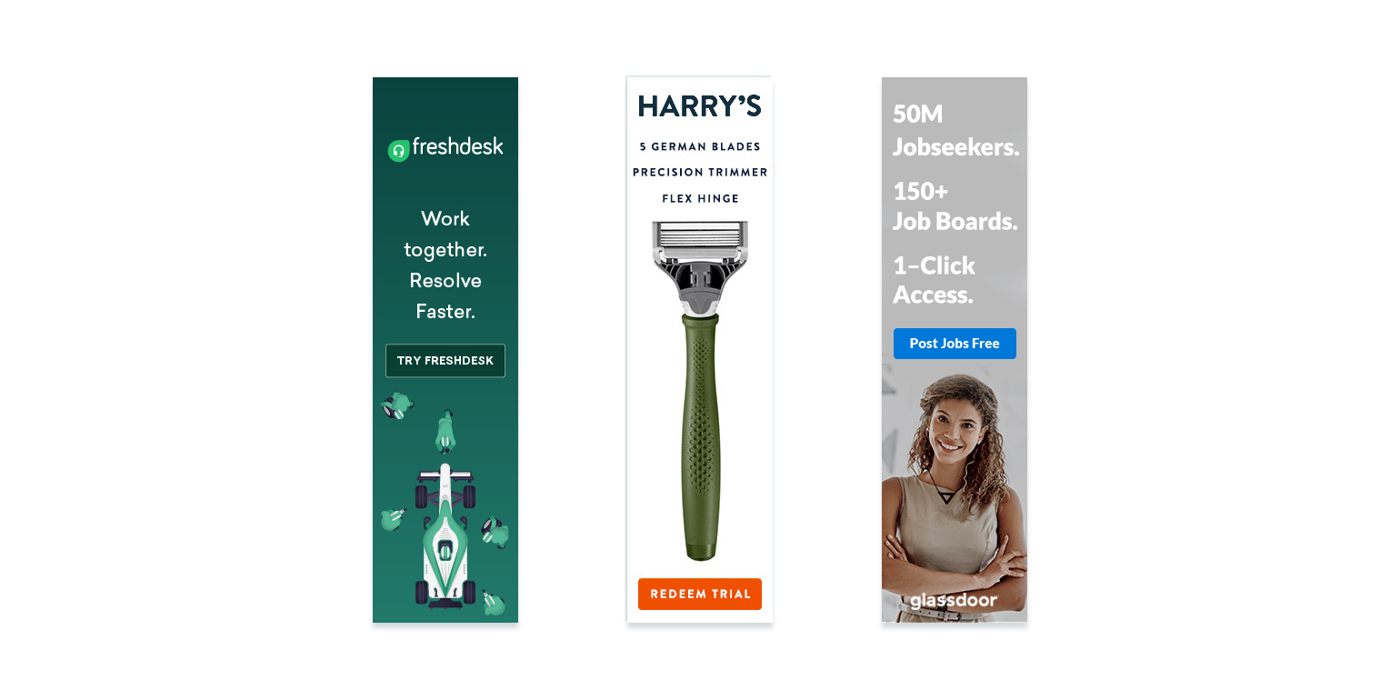

A good rule for using images in marketing is this: If it doesn’t enhance the creative, then keep it out. In this Freshdesk ad, you have an image of a pit crew. Why? It’s fun, it says cooperation, but does it make it any more likely someone clicks this ad? Not quite. Aside from that, the text could use a little clarity. It reads a little like the DOMO ad above. Okay, cooperation…get stuff done together, faster, but some more detail would help. An unclear ad leaves too much room for interpretation in the minds of prospects: “I see a headset in the logo…maybe this is a call center service. Or telecommunications software? I already have both…” Cooperation is vague. Users need more information before they click.
People don’t get excited by everyday. That’s what makes the first line of this Harry’s ad great. “5 German Blades” aren’t everyday. They’re exotic, refined maybe. A precision trimmer and flex hinge contribute to a close and comfortable shave. Lots of white space in this bold hero shot makes the product appear valuable.
Does the wide-eyed woman add to the value of this Glassdoor ad? Not that we can tell. Studies have shown that faces can stop scrolling internet users, but why not an image more relevant to the service? Aside from that, the text above is a great selling point: 50 Million Jobseekers, 150+ Job boards, 1-click access.” Translated this says: Lots of people will see your posting, and they’ll be able to access it easily. The CTA is the most persuasive of this group of ads too because it conveys a benefit in the word “free.” Widespread access to job seekers at no cost is the clear benefit this clickable ad conveys.
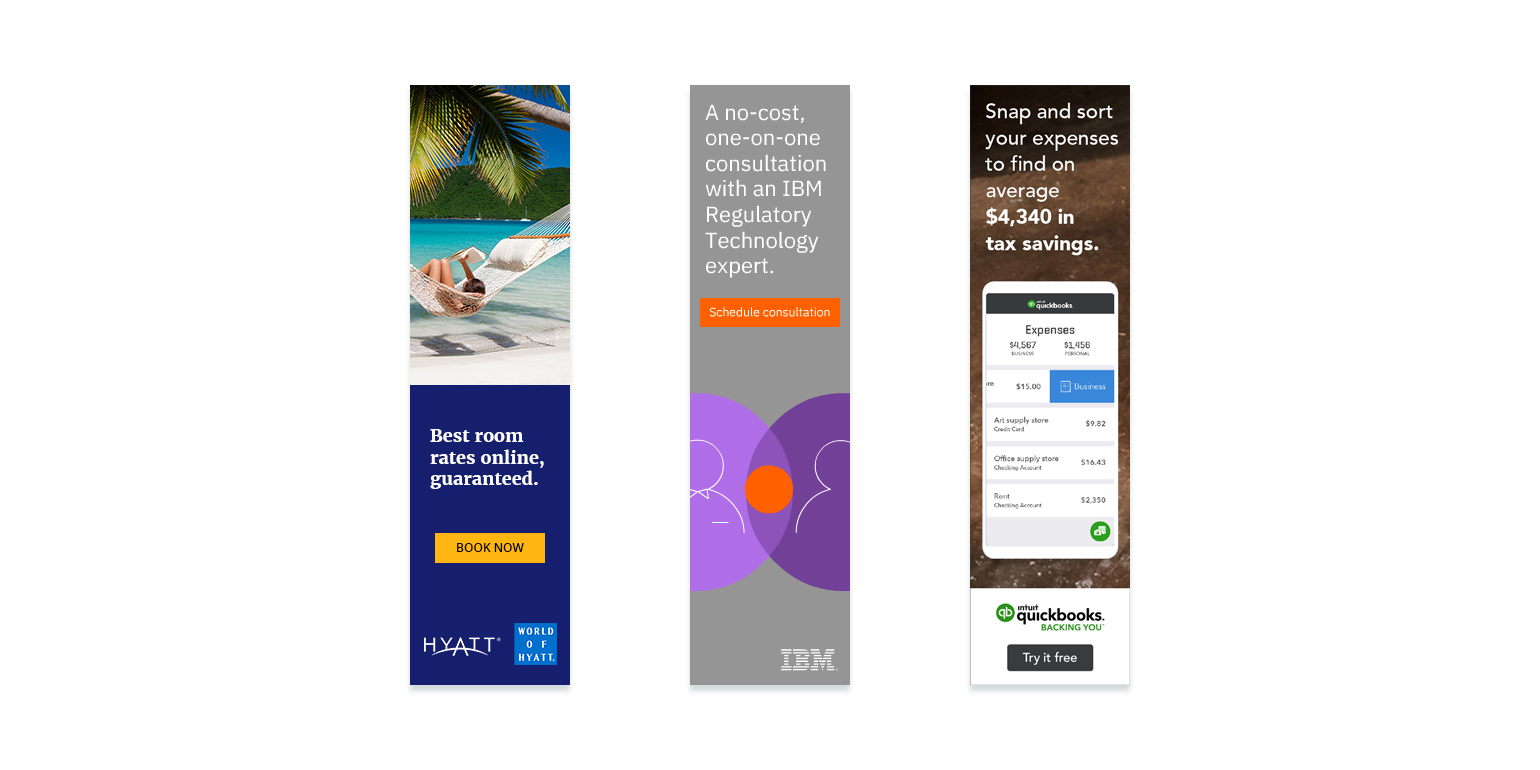

When used incorrectly, stock photos can poison an advertisement with irrelevance. And while shots on beachfront hammocks are overused in marketing, this one fits. Nothing says “time for a vacation” like an image that allows the prospect to imagine themselves reading by the ocean in the sun. Great job Hyatt!
How do I know if I want a one-on-one consultation with an IBM Regulatory Technology Expert if I don’t know what a regulatory technology expert does? This text should be more clear about what the benefit of a consultation with a regulatory expert will help with. Aside from that, the text “one-on-one” conveys personalization, which adds to the persuasiveness of the offer. So do the words “no-cost.” A free offer is always more likely to be claimed than a costly one.
Numbers are always more persuasive than words. This QuickBooks ad uses an average savings of $4,340 to lure visitors to its app, along with the phrase “snap & sort,” which implies easy uploading with a mobile camera. The image also adds to the value of the advertisement. Instead of featuring a stock photo of someone with a mobile phone at a desk, this ad features an image of the actual product in use.
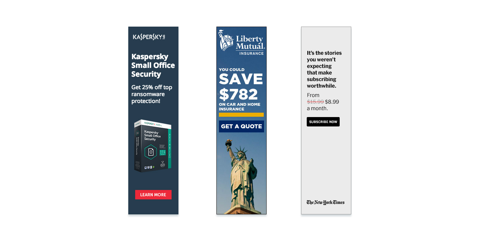
This Kaspersky ad has a bright and attention-grabbing CTA and a “25% off” text, which improve the chances of clickability. Additionally, the words “Small Office” help qualify the prospect by attempting to keep those with bigger offices from clicking (whom it seems the product would be wrong for). Working against this ad is the image, which doesn’t add much value. You could argue that the big box makes the antivirus software look comprehensive, but why not something like the graph on this landing page (number 11 in this post)? Why not a short and compelling testimonial? What about a few logos of high-profile users? Number of users? There are a lot better things you can do with that space.
“You could save $782 on home and car insurance” is a great sell if positioned right, but it seems a little too vague. You could also become a professional basketball player if you buy a basketball. Is that likely though? No. Is the $782 savings the average that people save when they work with Liberty Mutual? Is it the average they save when they switch from a particular provider? Is it a heap of money that one person saved once? This is a little to unclear for us. A little more clarity would heighten the clickability of this ad.
This New York Times skyscraper ad does a good job of informing viewers of a discount with the red line through the $15.99, however, the rest of it leaves much to be desired. Is it the stories you weren’t expecting that make the NYT worth subscribing to? Or is it the Pulitzer-Prize-winning journalism that you read for? The paper’s writers have won 125 Pulitzers. That’s more than any other newspaper, and probably the most persuasive selling point the business has.
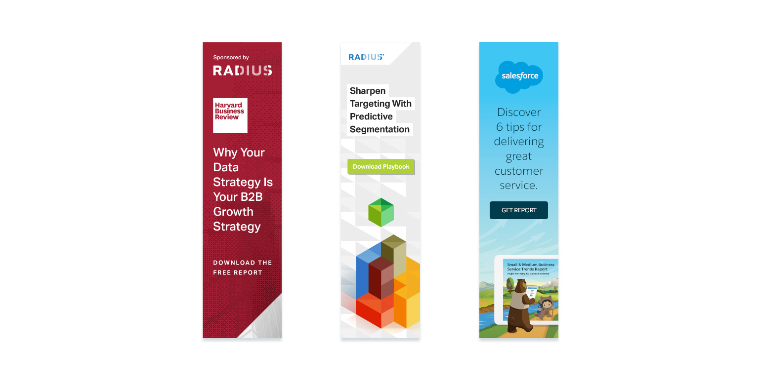
For some businesses, the most persuasive element they can feature on an ad is a logo. Harvardis one of those businesses. The perception is, “if it comes from Harvard, it’s valuable.” And not only is it valuable, but in this case it’s free. Still, this ad lacks the most important element for clickability: self-interest. Why should users care if their data strategy is their B2B growth strategy? What will they take away from this resource that will improve their business?
Here’s an ad from Radius that uses a brightly-colored Tetris sort of stock image to draw attention. The problem is, it really doesn’t add value to the clickability of the ad. The headline isn’t clear enough either, using buzzwords instead of coming right out and stating what the resource offers. What is a playbook? What will you get from this one?
As far as headlines go, this Salesforce ad might not win for creativity, but straightforward beats cute. What will you get from this resource? Six tips for delivering great customer service. Below the CTA is relevant, but somewhere the word “free” ‘could be worked in to tempt the reader even more. Under that, a bear reads a report next to the resource on a tablet. Here, it might be better to ditch the wildlife scene to make room for a maximized image of the resource.
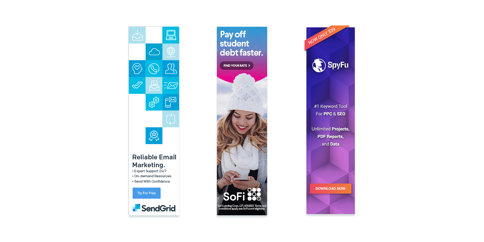
It’s good to be reliable, but it’s better to exceed reliability. That’s a quality expected by most businesses. It should be a given. One out of the three bullets below the headline in the SendGridad convey value: 24/7 customer support. That’s certainly something valuable not every business can offer. The others, however, are too vague. What are on-demand resources? “Send with confidence”? That’s expected now. These bullets don’t improve clickability, but the CTA does by drawing attention to a free trial.
SoFi doesn’t waste any time in this ad, which is simple but great. First, you have the headline, which is straightforward and packed with a powerful benefit: pay off student debt FASTER. For many grads locked into decades of payments, this is likely to resonate. Below, the image implies getting rates is so easy you can do it from your mobile phone.
Next up, SpyFu, which opens with a banner across the top corner of the ad. It reads: “Now only $39.” But what was it before? You can’t assume viewers will know. It’s probably best to take the route the New York Times did in their ad: Show the original price and contrast it with the new, lower price. Below that banner is the text “#1 Keyword tool for PPC and SEO.” This is a little like those signs outside diners that read “World’s best cup of coffee.” Coming from the business owner, it means nothing. If it were a testimonial from a client, that’s a different story.
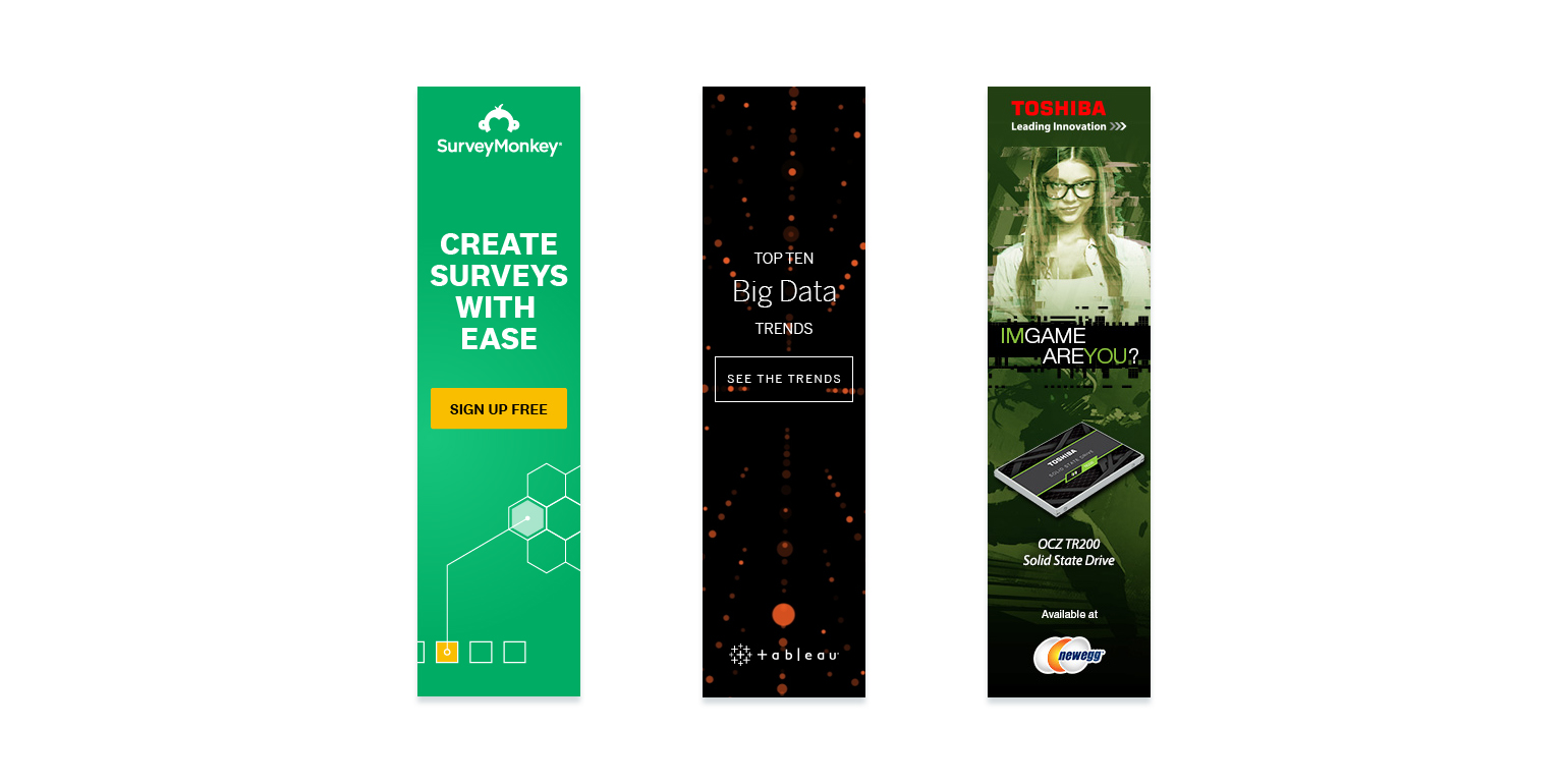
It’s unclear what the graphic on the bottom of this SurveyMonkey ad it supposed to mean, but the rest of the ad is straightforward. A bright CTA draws attention, and uses the word “Free” to enhance clickability. The headline conveys the benefit of the software simply: Create software quickly and easily. If that ambiguous graphic below were replaced by a hero shot or some benefit-focused bullets, this ad would look even better.
There’s not much to this Tableau ad, which isn’t necessarily a bad thing. Simple is usually better. However, there’s not much here about the benefits of claiming the resource. Luckily “top X” lists usually do well because the implied benefit is knowledge: learn the trends in big data so you can use them to your benefit. Still, this resource could be sold a little better. Is the report free? Were experts in data interviewed about these trends? They’re just a few ways to make the resource look more appealing.
If this Newegg ad doesn’t prove that businesses use sex to sell everything, nothing will. It says nothing about the product, there’s no CTA, and looking at the suggestive headline and model, it’s hard to take the product/tagline “leading innovation” seriously. Even if an ad like this were successful, it’s probably not something you want associated with your brand.
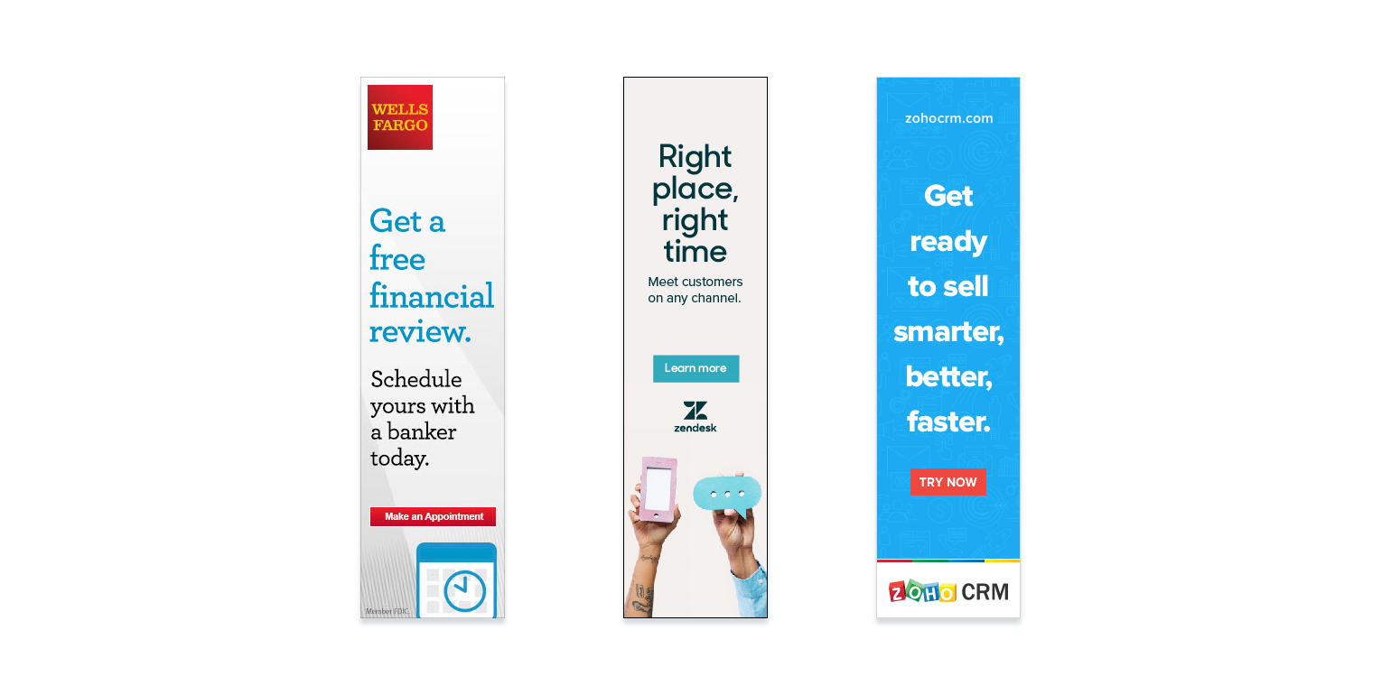
Wells Fargo’s offer is highlighted well, but the benefit of claiming it is less so. Get a free financial review? Why? What do people usually get out of attending one? The business’s logo is big and bold, using brand equity to add to the value of the offer. As in, bankers at Wells Fargo are likely to be trusted over ones from lesser-known businesses. The CTA is noticeable but “make an appointment” doesn’t really compel you to click, does it? Overall, with a few minor tweaks this ad could go from good to great.
Today, every business needs to be able to “meet customers on any channel.” That’s why Zendesk’s ad text will resonate with entrepreneurs who see it. This noncommittal CTA doesn’t call users to sign up or start a trial or buy — simply to learn more. Below, what may look like a pointless image of two hands isn’t: the hand on the left implies you can communicate with prospects via phone, and the one on the right implies you can communicate with them via text.
Selling smarter, better, faster would be great, but a lot of products help businesses do all three of those things. What does this Zoho CRM do specifically? The “Try Now” CTA pops on the background of the ad, but it also attempts to earn a signup, when something less committal like “learn more” might reassure the prospect they won’t land somewhere they need to input their credit card info.
How do your skyscraper ads compare?
The preceding examples demonstrate how to design skyscraper display ads based on catchiness, clarity, clickability, and creativity. Each ad is considered the pre-click stage; what follows post-click is just as important, however, because that is what generates the conversion.
Source: Instapage