Australia, this is how tens of thousands of your hard-earned taxpayer dollars have been spent. But can you spot the difference?
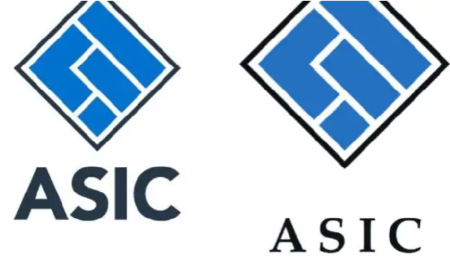
ASIC charged taxpayers $100,000 to slightly change its logo.
The country’s corporate industry watchdog forked out a staggering $100,000 for a barely noticeable rebrand — and Australians are less than impressed.
The Australian Securities and Investments Commission (ASIC) started looking into a new logo within weeks of the banking royal commission being announced in 2017.
ASIC told designers it wanted to be seen as having its “finger on the pulse” — but according to social media users at least, it has failed miserably.
• Dodgy magic number survives grilling
• Problem facing cult beauty favourite
• Ridiculous word billionaire wants banned
The organisation ended up enlisting the services of Sydney firm Folk, splashing more than $43,000 on “creative development” plus GST, almost $60,000 on “design and asset development”, which included new banners, stationery templates and improving the homepage.
A “web design update” cost close to $3000, bringing the total bill well above $100,000.
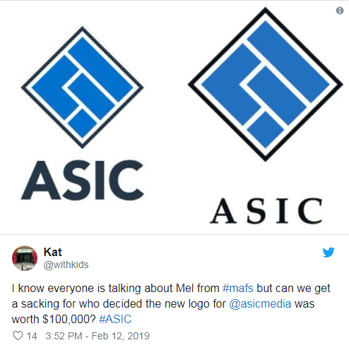
Spot the $100,000 difference
The debacle was first raised by federal Labor MP Matt Keogh, who asked ASIC to reveal its rebrand spend last October.
He said the public were outraged by the waste, and couldn’t resist taking a jab at the organisation.
“When ASIC’s budget has been cut so significantly under the Liberal government, they can’t afford to be wasting taxpayer dollars,” Fairfax reports Mr Keogh as saying.
“(Scott) Morrison promised a tough cop on the beat, what we got was simply comic, sans any true enforcement.”
The decision has been seen by many as all the more galling given ASIC was specifically singled out in Commissioner Hayne’s final report, which claimed, “Too often, financial services entities that broke the law were not properly held to account.”
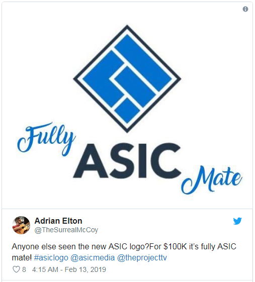
Unsurprisingly, the response on social media has been brutal.
Many Australians have taken to Twitter to vent — and have a laugh at ASIC’s expense.
“I know everyone is talking about Mel from #mafs but can we get a sacking for who decided the new logo for @asicmedia was worth $100,000?” Twitter user @withkids said, while Karen Hinds joked she “could have got a better deal for ASIC. $10.00 from Vista Prints for new Logo.”


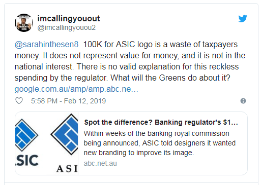
Others, such as Twitter user @imcallingyouou2, were angry, arguing: “100K for ASIC logo is a waste of taxpayers money. It does not represent value for money, and it is not in the national interest. There is no valid explanation for this reckless spending by the regulator.”
However, ASIC’s senior executive leader corporate affairs Matthew Abbott argued the update was necessary as the logo hadn’t been changed in two decades.
“ASIC’s branding update was about making sure ASIC’s materials are suitable for digital channels …” he told The Sydney Morning Herald.
The biggest change seems to be the font, with the ASIC symbol undergoing little if any change.
Last year, the ABC revealed Folk’s pitch described the logo as: “Symbol good. Type Bad.”
In a document leaked to the public broadcaster, ASIC reportedly told Folk it wanted to revamp its “visual identity”.
“We need to be respected. Not loved,” the pitch reportedly said.
“Strong. Accountable. Firm/fair. Finger-on-the-pulse. Contemporary. Informed.
“Vigilant. Transparent. Responsive.”
Source: News