Facebook business pages are a place where you can develop the relationship between your brand and the world at large.
Whether you’re responding to customer feedback, nurturing prospects, sharing content, or simply informing some subset of Facebook’s 2 billion users what time your widget shop closes on Tuesday evenings, Pages are one of the most important online properties that you can plant your flag on. They’re a necessary tool for businesses operating in the 21st century.
They also have a boatload of moving parts, which is a nice way of saying that creating a business page can be a major pain in the ass.
See all those red squares?
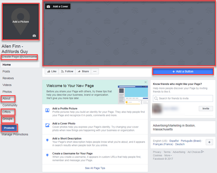
Some would call them headaches: I’ll call them opportunities.
Today, we’re going to tackle the challenge of making a great Facebook page for your small business.
But first…
Getting Started with your Facebook Business Page
Once you’re good and ready, navigate over to Facebook’s “Create a Page” page to get started.
There are six different types of Pages that can be created on Facebook, but today we’re going to focus specifically on “Local Business or Place.” If the other top-row options (“Company, Organization or Institution” and “Brand or Product”) describe your organization more effectively, pick one of those: most of the steps will end up being the same.
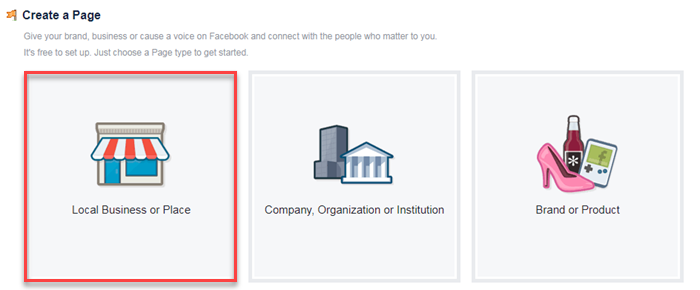
You’ll notice that there’s also a second row of page types you can choose from. These options are tailored to promoting art, entertainment, and causes/online communities. Since there’s less commercial intent in these niches, some of the nuances we touch on in this guide won’t be applicable. Many components of these pages do overlap with those of SMBs: if you’re starting from scratch, there’s value to be had from this here post.
Select the first option on the menu and the adorable little storefront will slide out of view, revealing the following form:
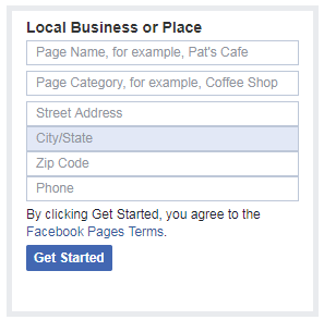
Pretty straightforward stuff, but filling in the fields now will save you doing it again later. If you’re having trouble with the “Page Category” field, just choose something that relates to your business in any way; you can edit your selection later.
Once completed, click the blue “Get Started” button and you’ll be taken to your brand new empty shell of a Facebook business page.
Templates & Tabs: The Foundation of Your Facebook Business Page
Before we start adding images and writing copy, we’re going to spend some time getting everything juuust right in the “Settings” tab. You’ll see the link in the top right-hand corner of the Facebook UI.
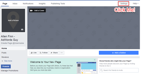
Congratulations! You’ve officially been transported to Page creation’s most intimidatingly bland page. Despite having the aesthetic appeal of multigrain Cheerios soaking in wood glue, this page is riddled with useful information you’re going to want to check out after you’ve created your page in earnest.
First thing’s first, though: let’s shift your page template to something a bit more business friendly.
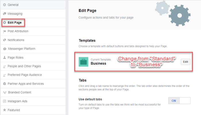
Under the “Edit Page” option on you’ll notice a section called “Templates.”
Changing your page’s template will alter the tabs that visitors can access on your page. Your new tabs will be as follows:
- Home
- Posts
- Reviews
- Videos
- Photos
- About
- Community
- Offers
- Groups
(Note that you can remove or adjust the order of your Page’s tabs directly below the “Templates” section of the Edit Page menu.)
![]()
In addition to providing you with a tailored suite of available tabs to help your page visitors, using the “Business” template will also add a customizable CTA button (more on that in a minute) to your page. Before heading back to your business page itself, you should take some time to familiarize yourself with the mound of customizable options available to you in the page settings interface.
While this probably isn’t the time to set page roles or enable more engaging chatbot functionality (you’ve got the rest of forever for that), you should establish a preferred page audience…
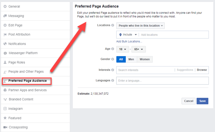
Facebook will use this information to help connect the users you identify as most valuable to your business to your page. It works in the same way as audience creation does within the Facebook Business Manager UI. There’s no need to get too granular here, but painting a picture of your ideal prospect will help Facebook suggest your page to people who may very well dig it.
Eye Candy: Page Profile and Cover Pictures
Now that you’ve bounced back over to your business’s page, it’s time to add the first bits of flair.
Your cover photo (or video!) is the first thing a page visitor is going to notice. As a result, it needs to serve a purpose. You might share a video of your team members solving a common goal to hammer home the collaborative nature of your workplace (particularly if you plan to use your Facebook page to promote company culture and grow brand awareness).
You can also use the cover photo to advertise an impending event, offer a discount code, or simply convey the benefits of your product or service.
I say that to say this: you need a killer cover photo.
Profile pictures, on the other hand, are a straight-up brand play. Due to size constraints, you’re better off using your logo than trying to cram something elaborate into a tiny square frame tucked in the top-left corner.
With that, here are some more guidelines and best practices for both profile and cover pictures.
Your Facebook profile picture
Your profile picture only needs two things to be successful: familiarity and scalability.
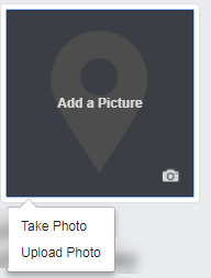
In truth, most folks won’t even notice that it exists. Their eyes will be drawn to the larger, more dynamic cover picture or down the screen to where pertinent information resides. You shouldn’t attempt to distract with your profile picture. It should be to your page what the hidden arrow is to the FedEx logo: a subtle complement.
On a computer, your profile picture will display at 170×170 pixels; on a smartphone, it’s 128×128. This is why it’s so important to steer clear of text: nobody’s going to be able to read it. Instead, opt for something clean. If you don’t have time to develop something elaborate, that’s totally fine: just use your logo. Heck, that’s what we do:

You should also note that, when you begin to use Facebook ads or engage with page visitors, your profile picture will be shaved down into an even smaller circular image.
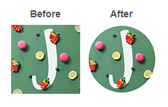
If key components of your logo live on the fringes of the frame, consider repositioning the image so that design elements aren’t cast asunder.
Your Facebook cover picture (or video)
This one’s a bit trickier because you’ve got so much more space to work with.
If you haven’t already added a cover element to your business page, you should see an expansive grey wasteland atop your content. Click the “Add a Cover” button in the corner of this space to give yourself the option of either adding a photo or a video.

Your cover photo Displays at 820×312 on computers and 640×360 on smartphones. If you want to use a video instead, it must be between 20 and 90 seconds and no smaller than a cover photo.
Regardless of whether you decided to roll with an image or a video, avoid clutter at all costs. Visitors can scroll down your page to find swaths of copy to read. Your cover element should be a brand play, something fun, and evocative, not a how-to guide. Take Whole Paycheck for example:

Assorted gourds aren’t unique to the upscale grocery chain, but they certainly indicate seasonality and provide a lovely backdrop for the litany of Fall-centric recipes you can find on the page. Sometimes, simple is best.
Oh, and be sure to switch your cover element out frequently to see how it impacts engagement (those pumpkins might look a little funky come July).
A Memorable Facebook Page Username is Essential
Having a username associated with your business page will allows prospects, customers, and total strangers to tag your business in posts and comments. The username is an essential component of establishing and maintaining brand engagement. it’s also, like, the easiest thing to implement.
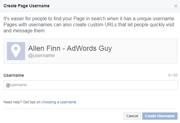
Now, the obvious play is to use the name of your business as your username.
If someone’s already commandeered your name (you can’t claim a username that someone else is already using), you’re going to have to get a bit creative. Provided you can stick to alphanumeric characters and come up with something that’s at least five characters in length and devoid of bigotry or foul language, you’re good to go.
One suggestion here: If your business is hyper-local or the page you’re creating is for a single location, append a geo-modifier to your username (instead of just “@businessname,” use “@businessnamelocation”). This can help to convey trust and gives you the ability to share the most relevant content.
Bolster Engagement with a Button
Adding a button to your business page is a simple, low-stakes way to push visitors towards action. Whether you’d like someone to schedule a consultation, download an app, or make a purchase, pinning a button to the space below your cover image is a free way to incite action that you might otherwise have paid for.

To add a button to your business page, click “+Add a Button.”

From there, you’ll be directed to an overlay that outlines the five different CTA options available to you. These include:
- Book Services
- Get in Touch
- Learn More
- Make a Purchase or Donation
- Download App or Game
For the sake of maximizing business value, let’s say you select “Make a Purchase.”

Simply click the “Make a Purchase or Donation” option…

If you plan to bake offers into your page (this was one of the pages you added by switching over to the business template) you could use your button to promote them. That being said, I’m a proponent of asking people to take actions that have a more direct impact on business.

For that reason, I’d suggest choosing the “Shop Now” option (if you’re selling a product). Once selected, enter the URL of your product page and voila: prospects who dig your business page now have a direct path to purchase. (For lead generation outfits, the “Book Services” button will allow you to link to a relevant page on your website. Setup will look the exact same as outlined above.)
Add Relevant Business Details to Help Customers Find You
You’ve gussied up your Facebook business page with eye-catching visuals and interactive elements: now it’s time to input some information.
Jump over to the “About” tab and click the “Edit Page Info” link at the top of the page.

This will open a single, streamlined menu through which you can enter basic information about your business, including:
- General – This is where you can alter your business’s category and add a brief (255 character) description of what it is you do.
- Contact – Phone number, link to website, email address. You can also link to additional pages here (product-centric content, careers, etc.).
- Location – You can opt out of including your location on your page by unchecking the “Customers visit my business at my street address” box below the map.
- Hours- Pretty self-explanatory.
Upon completion, double-check your business information for accuracy, kick your feet up and crack open a cold one: you’re finally ready to start posting content and promoting your business on Facebook!
Promoting Your Business on Facebook
While a business page is going to give you the ability to provide general information about your offerings and share new content to existing fans, it isn’t going to function as an explicit lead generation tool without advertising.
Source: WordStream
Looking for an agency that can help you in your marketing strategy? Contact Top4 Marketing, an award-winning digital marketing and technology services agency providing solutions to the largest and upcoming brands across all industries and government in Australia and across APAC.


