Almost every great tech company is using banner advertising to get to the right users with relevant information. This is why I want to show you 27 of the best banner ad examples I saw in my research.
There are more and more tech companies that try to create a better experience for the web presence, but they also use the internet to help people like me and you find a solution for our problem.
So whether you’re working in tech companies or you just want to see how these brands design their banner ads to convert more users, you should definitely read this article and bookmark it.
Because here you will learn how Google, Facebook, Netflix or Shopify are designing their banner ads to gain users, increase profit and last but not least, have an impact on the industry.
So, if you need some banner design inspiration, check out this article:
1. Adobe
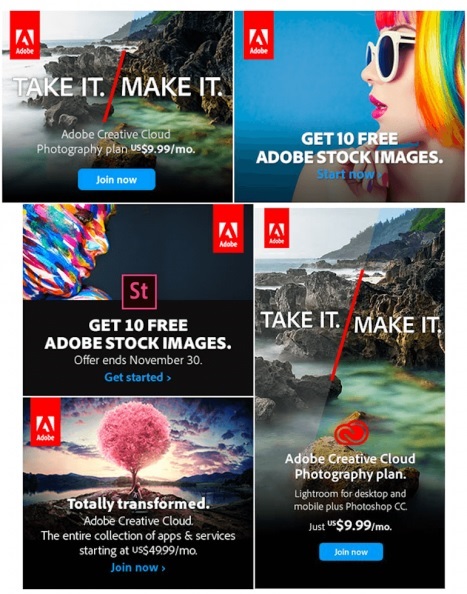
When I say Adobe, what is the first thing that pops into your mind? Creativity? Photos? Design? Photoshop? Money? Well, what if I told you that every one of these words are in integrated in their banner ads? They are using urgent message that make the user click on the banner ad right in the moment they see it. With messages like “GET 10 FREE” or “TAKE IT/ MAKE IT” the message makes it clear and simple: now is the moment.
Also, Adobe is very serious about their logo and they are placing it in same spot in every banner ad: at the top right or left corner of the banner ad.
2. Amazon
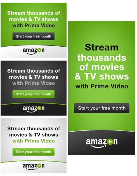
Let’s say that your business is a big one and you have different categories. Which one do you promote on your banner ads? Do you include everything in the same banner ad or does every category have its own group of ads?
Amazon is a great example on how to create a banner ad for every service you offer. Just look at how they designed them for “Amazon Prime”. Also, do you see how important A/B testing is for them and how they use their message, colors and CTA buttons?
This is why we always tell our users to experiment with their banner ads and then measure to see which one is performing better.
3. Bing
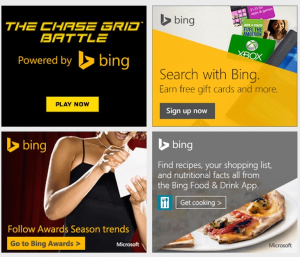
When I’m looking at these banner ads, I see 3 situations: a brand that is proud of the project it is sponsoring, a brand that creates an emotion and a brand that sells a promise. And when you see a brand in one of these 3 situations, that means it is on the right path.
Bing is a great example on how to design a banner ad for the right user.
4. AOL
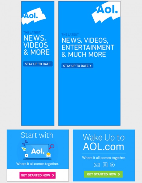
What’s the main color of your brand? How do you make your banner ad stand out? AOL is using a wonderful color and a simple message. What I also love about these banner ads examples are the colors of the CTA buttons with the clear message “Get Started Now”.
5. APPLE MUSIC
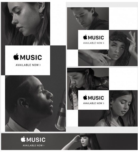
If I would ask you to design a banner ad that is promoting one of Apple’s products, what is the first thing you would you do besides inserting their logo? Something simple or something complicated? Exactly. Apple Music already created a big buzz in the industry, so there’s no need to make a big fuss over their banner ads. Which is why a simple “Available Now” message is more than enough.
6. CISCO
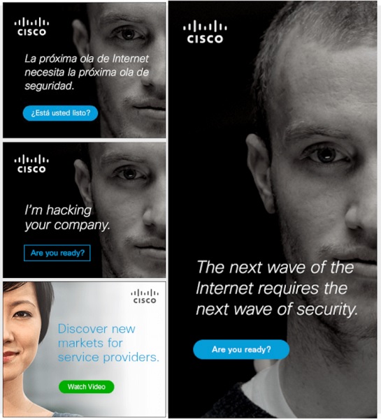
How do you create an emotional connection on the internet? By using powerful messages and visuals that make the user think about them. This is how CISCO has done it when they launch the “I’m hacking your company” project. Because nobody wants to be hacked so they want the fastest solution they can get.
Also, CISCO showed that they are an international company and they can target multiple nationality users.
7. EBAY
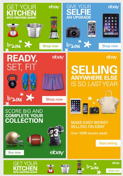
Ebay is one of the biggest player in the banner advertising industry. Not only that they invest a lot of money in display advertising but also how they design the banner ads. They are selling an emotion and also they are creating a need in every user mind that is seeing these banner ads.
Just look at it and tell me that you don’t want to upgrade your kitchen tools.
8. DELL
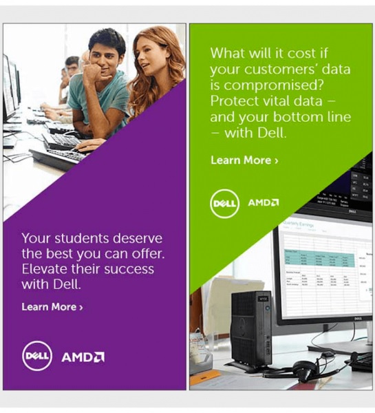
Here is another example on how to use colors in your banner ads. DELL designed these banner ads using only 3 elements: hiqh quality images, a simple color as a background and their logo.
Oh, and I almost forgot, look how nice they inserted the CTA button “Learn more” by bolding it a little bit and adding the right amount of space between the logo and the text.
9. DROPBOX
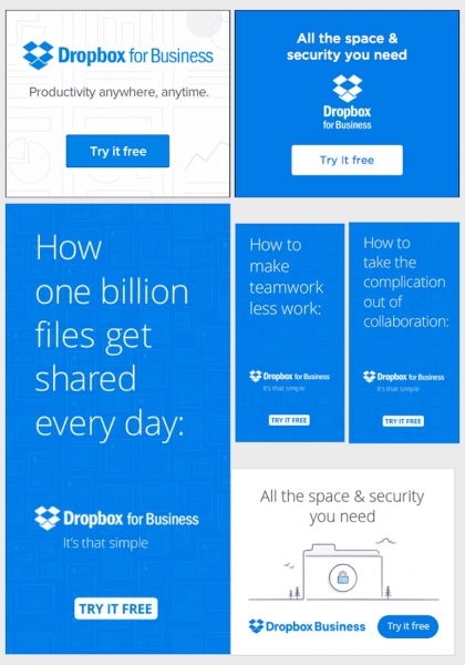
How often do you use Dropbox and how did you find out about them? Some of us have found out about Dropbox from our friends and some of us saw a banner ad that talked about “space” and “security”. But what I actually love about Dropbox’s banner ads is the great and creative headline talking about the benefits of using their product: “How one billion files get shared every day” or “How to make teamwork less work”.
Is this a good banner example? Yes it is.
10. EVERNOTE
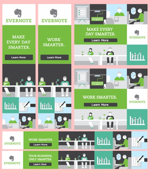
Every time I have an idea and I’m not in front of my laptop I open the Evernote App and write it down. Evernote is a great tool every marketer or business man should use. And the message you find on their banner ads is either “Work Smarter” or “Make Every Day Smarter”.
Because smart people use smart apps, right?
11. FACEBOOK
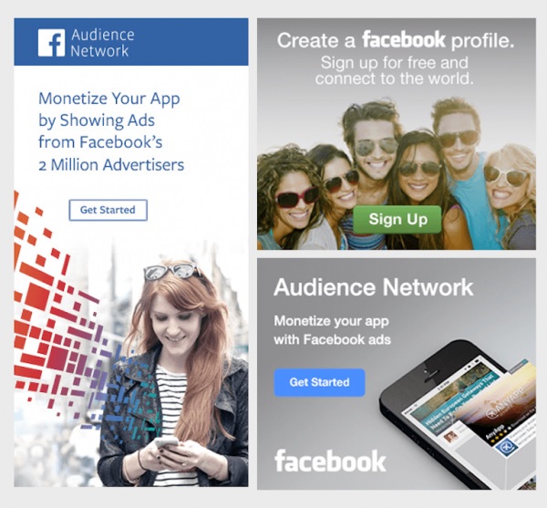
I don’t know if you’ve seen banner ads from Facebook lately but they also have certain periods of time when they use display advertising to promote their network. And from what I see, they’ve done a great job telling the business owners and marketer how to monetize their app with Facebook ads. Let’s admit it, Facebook ads act like banner ads, but on a different inventory.
So who said banner ads aren’t working?
12. HP
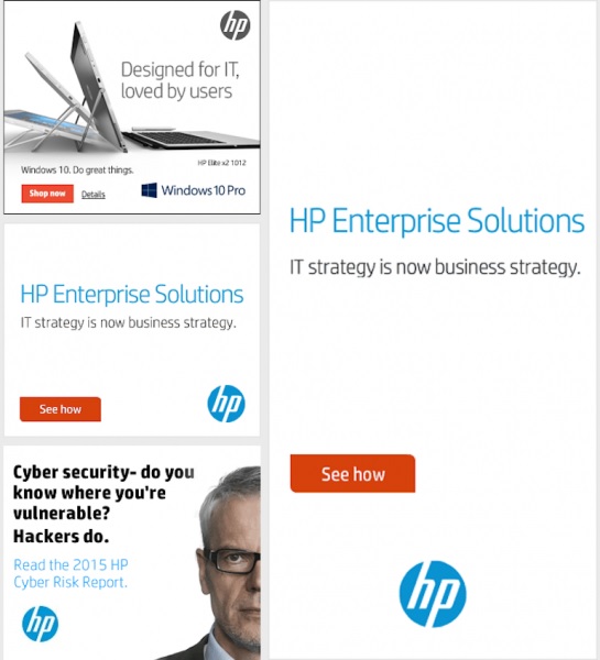
Time is money and money is business. This is what you can learn from the HP banner ads. Because their main target is made up by users who connect with the term “enterprise”, they are selling a simple solution for busy people.
So this is why their banner ads have to be straight to the point, with a clear message.
13. GOOGLE
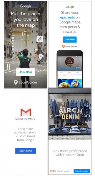
When you want to design a great banner ad that converts and you’re lacking inspiration, you just need to take a look at the ones who created this form of advertising and learn from them. This is why I’m going to let Google show you how they do it and maybe you can steal some of their tactics.
But the main point you have to focus on is that simplicity will always have a bigger impact.
14. LinkedIN
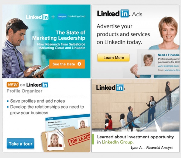
Social media is a great way to connect with people. Also, on a social media platform you can advertise and help you brand connect with your future clients. The most important thing is to find the most suitable platform for your business and when you’re in the B2B industry, LinkedIn is definitely your platform.
So, if you want to push your brand forward by advertising on their platform, I recommend you do it the way they do it.
15. MailChimp
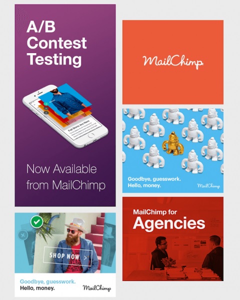
Is your brand strong enough to only insert your logo and use that for display advertising? This is another thing you can do with banner ads: brand awareness.
MailChimp is one of the brands that uses banner ads to increase brand awareness and also to remind users they are more than an email marketing company.
Designers love this banner ad example that is a great inspiration for them.
16. IBM
IBM is one of the brands that really knows how to design their banner ads and how to connect with the user. Look at these faces and read the message. Because IBM is not only a tech company, it’s a brand that is trying to solve different problems that we all deal with in our everyday lives.
Also, if you look closely, you can see that their CTA button is at the bottom with a longer message accompanied by a helpful guiding arrow that makes you click on the banner ad to learn more about their solutions.
17. INTEL
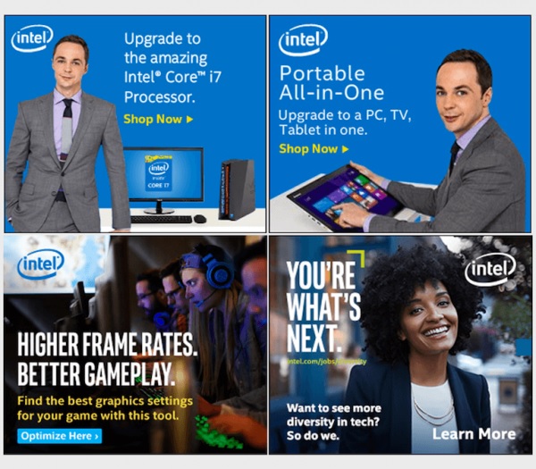
I believe in the power of influence marketing and I also believe in well done display advertising. But what if we can combine these 2 powers and make them work together? Just like Intel is doing it with its brand ambassador, Sheldon from “The Theory of Big Bang” series.
Simple but efficient, they are gaining a lot of recognition in the industry.
18. Microsoft
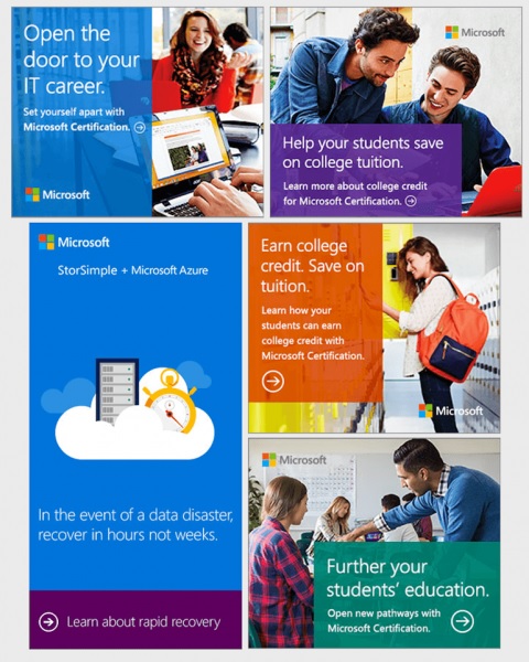
I love the way Microsoft designed their banner ads by using a certain percentage of transparency on the colored shape that’s underneath their message and how they connect with the user by showing different possible real life scenarios.
Microsoft is promoting their Certification project to the young adults by talking to them about financial education, college debt and other thing they are interested in.
Another great example on how to use the color in your banner ad.
19. Mozilla
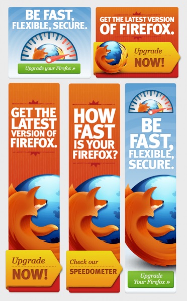
Tech companies should stay updated with the latest trends. So upgrading their product is an important factor for their business. Mozilla understood this strategy so every time they upgrade it they use banner ads to let the users know about it and also to try to get more users to use their platform.
20. ORACLE
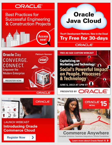
The sense of urgency can be a great psychological decisive factor to make the user click on your banner ad. Using words like “NOW”, “START TODAY” or “ACCESS NOW” can make the user click on the banner ad. Just like Oracle is doing with their banner ads by writing down the right CTA.
Also, if you want to make it more urgent, just put a mouse arrow on the button.
21. PAYPAL
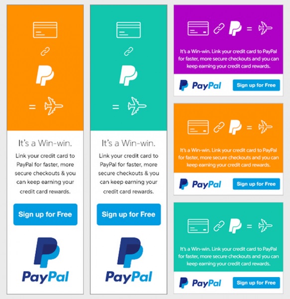
Think about this: if i design a plane, and you are from the US and I bring a friend from France, one from Germany and one from China and I show it to everyone, what do they see? A plane, right? This is why visual elements can talk an international language.
And PayPal understood this when they created these banner ads. So using icons or linear graphic elements can help your brand reach a wider audience.
22. NETAPP
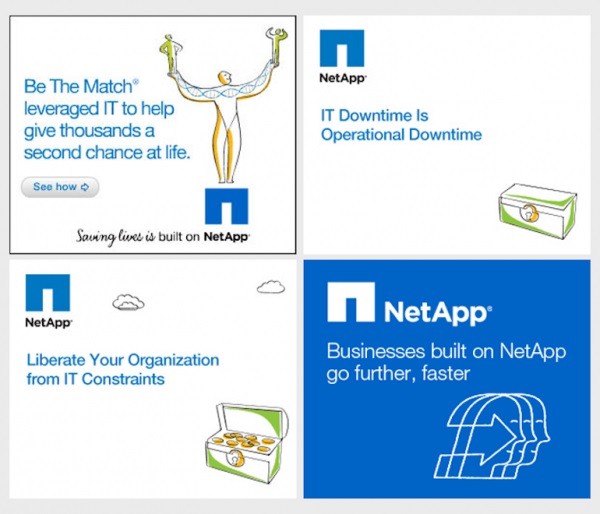
I think a banner ad should send a clear message and make the user click on it because it contains valuable information. This is what NetApp does with their banner ads.
A simple design, a clear message, a nice visual element and the guideline color. Simple and efficient.
If we use the right element in the rectangular form we don’t have to blame the rectangular for not working anymore.
23. NETFLIX
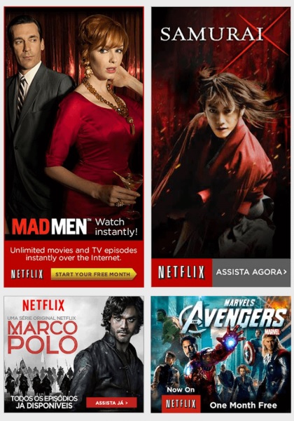
I only hope that with these banner ads I remind to look at your favorite tv series on Netflix. And guess what? This is exactly what Netflix is doing it with their banner ads. They are using them to promote their tv series and other services you need after a hard day at work.
Do you see how they use the “Free” element in their banner ad. So people can start looking at their favorite series for free for the first month. And this is a great marketing strategy!
24. SHOPIFY
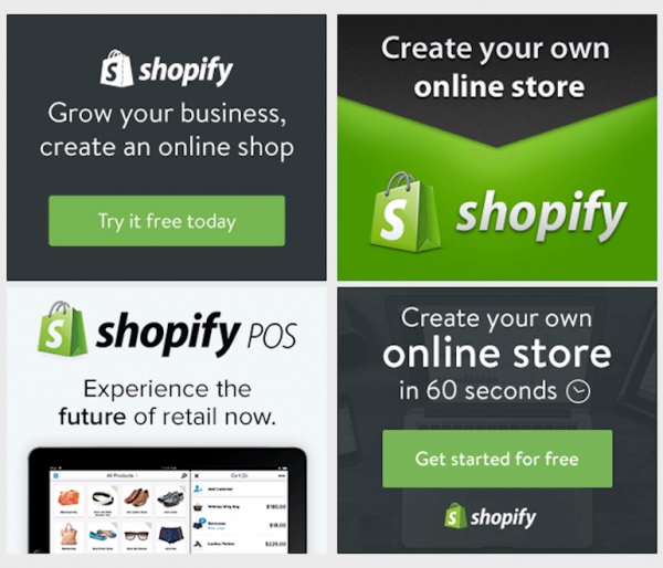
You will never know which banner ads are converting better if you don’t test them. So start designing, not only one banner ad, but 3 or 4, and let them do their job – let them convert. Then analyze them and see which one works better and optimize it.
Shopify shows us in their banner ads that they are not only a/b testing them by playing with the colors but also by changing the way they show their message and by playing with the other elements in the banner ad.
25. SKYPE
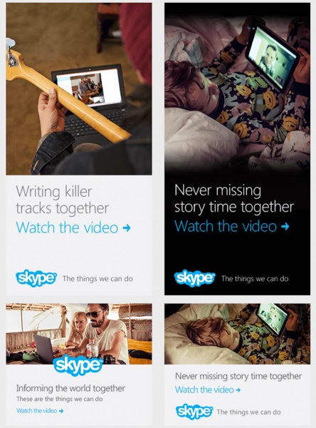
Did you ever think about using your brand color on your CTA? Look at how Skype is designing their banner ads where the “Watch the video” with a simple arrow has the same color as the “Skype” logo. Simple and effective.
Also, you can use your brand mission in your banner ad, if you have enough space.
26. Yahoo!
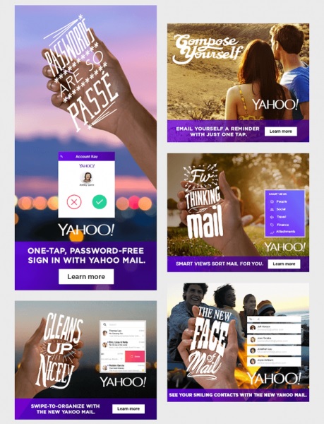
Creativity is a must in your banner design if you want to make the user click on it. You can create an “aha” moment in their mind or just make them laugh. Emotional connection between a brand and a user can be a first step in their relationship.
This is what Yahoo is doing with their banner ads, using creativity to engage with the user.
27. YouTube
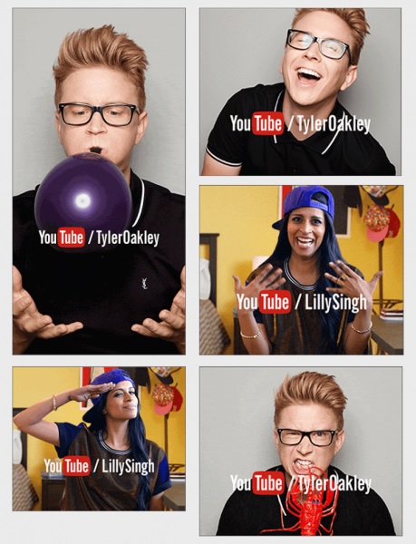
Working with content creators and influencers can help your brand get a lot of attention in the industry. So why not put those influencers on your banner ads and show the community that your brand embraces the power of influence marketing.
This is what YouTube is doing with the vloggers. Using their image on their banner ads to attract more users on the platform. And it’s working!
Your Turn
If you felt inspired by these banner ads examples and you want to break the chains of creativity just start designing banner ads and let your inspiration do its job.
Source: Bannersnack Blog


