Every savvy marketer knows the importance of upselling:
- The probability of selling to an existing customer is 60-70% while selling to a new prospect is only 5-20%
- Loyal customers are up to 10x more valuable than new ones
- Selling to existing customers provides an exponentially faster ROI than only acquiring new customers
These stats make it easy to see why upselling is effective and a proven strategy, and why upsell landing pages are necessary to ensure sustainable business growth for any brand.
What is an upsell landing page?
An upsell landing page uses persuasive elements and techniques to drive an existing customer to purchase a newer, more expensive, or more robust version of a product or service. This page type can also be used to suggest add-ons a customer could make to their current order before purchasing:
This type of page is different than a typical landing page because its success is largely based on psychological principles. While the principles of conversion optimization are always founded on a basic understanding of your consumer, an upsell landing page focuses more on their perception of, and connection with, your offer. This means you must apply certain psychological principles to your page.
4 psychological principles to apply to upsell landing pages
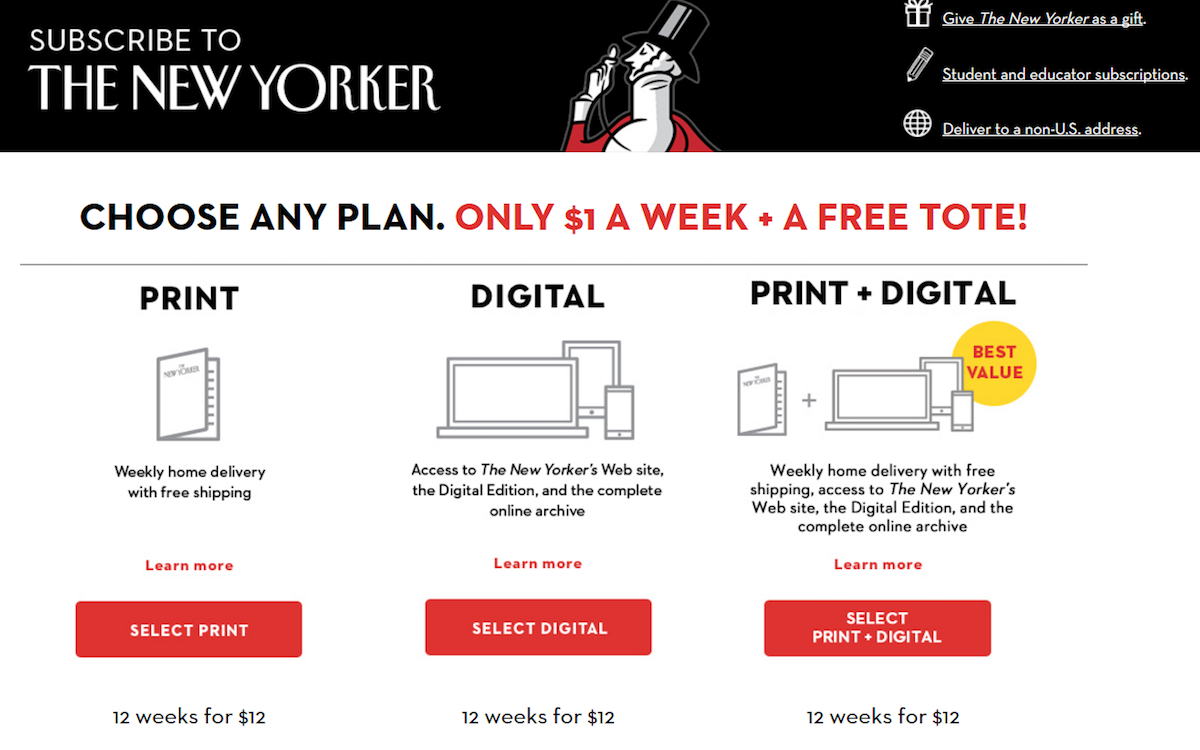
1. Decoy effect
The decoy effect refers to people’s change in preference between two options when a third and asymmetrically dominated option is presented. This technique is perfect for sales pages, and subtly nudging prospects in the direction of the one you want them to claim.
Consider The New Yorker example above. If “print + digital” was the only offer on the page, it wouldn’t look as appealing as it does next to the “print only” and “digital only” options. Since all three options are $12, why would anyone want the print only or digital-only edition, instead of both?
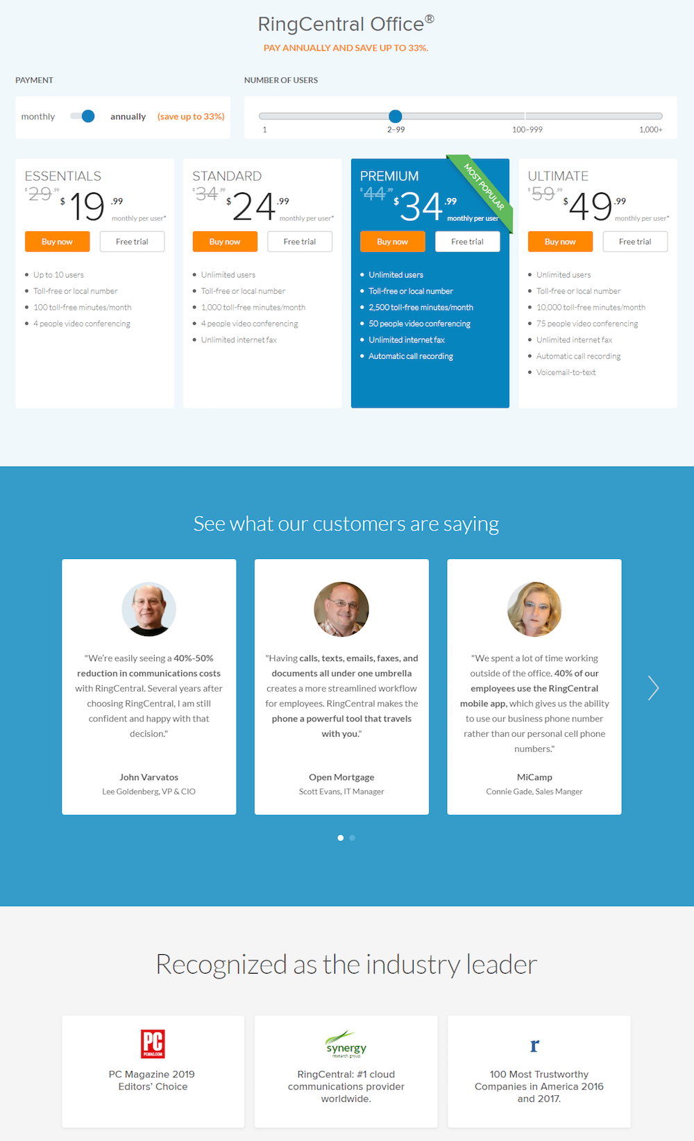
2. Social proof
Social proof refers to a consumer’s perception of something based on the actions and opinions of others. This can be powerfully convincing on landing pages, in the form of detailed testimonials, big-name brand logos, and social media count tickers.
RingCentral includes both testimonials and various awards won directly underneath the package options:
3. Paradox of choice
The paradox of choice argues that the fewer options you give visitors, the better, because more choices can be overwhelming. On traditional landing pages, there should only be one offer. However, upsell landing pages that offer multiple plans, packages, or subscriptions are an exception to the rule.
4. Scarcity
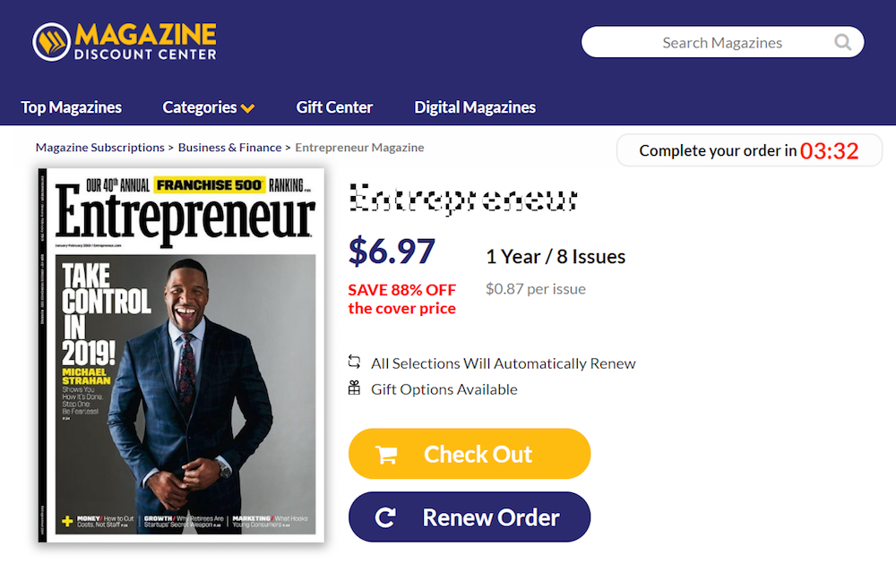
Scarcity is based on people’s tendency to overvalue a resource when there’s less of it, or it’s running out. You can take advantage of this on a sales page or upsell page, by including time-sensitive offers like webinars or conferences, or limited quantity physical products like books. Availability indicators, urgent CTAs, and countdown timers all help present scarcity:
Now let’s see how these psychological principles can be used in action.
4 upsell landing page examples
(For shorter upsell landing pages, we’ve shown the entire page. However, for longer pages, we only displayed above the fold. You may need to click through to each page to see some of the points we discuss. Also, keep in mind that some brands may be A/B testing their page with an alternate version that is displayed below.)
1. Grammarly

What the page does well:
- The Grammarly logo isn’t linked to the homepage, so it won’t drive visitors off the page when clicked.
- A progress graphic at the top shows visitors where they are in the conversion process, and how many more steps they need to take before it’s complete.
- An icon-bulleted list with bold copy shows prospects what they get with a Premium upgrade.
- Red CTA buttons stand out from the rest of the page content.
- The money-back guarantee makes prospects more comfortable with converting.
- Security badges (Verisign and McAfee) act as trust signals, making visitors feel more comfortable with submitting their information.
- Testimonials from authoritative publishers serve as social proof for this landing page upsell offer.
- Follower counters from Facebook, Twitter, and Google+ also add social proof to the page.
What could be A/B tested:
- Displaying all of the testimonials at once, instead of a slider, would ensure prospects see all of them.
- Changing the CTA button copy to “I Want This Plan” is more descriptive and uses first-person.
2. Bloomberg Businessweek
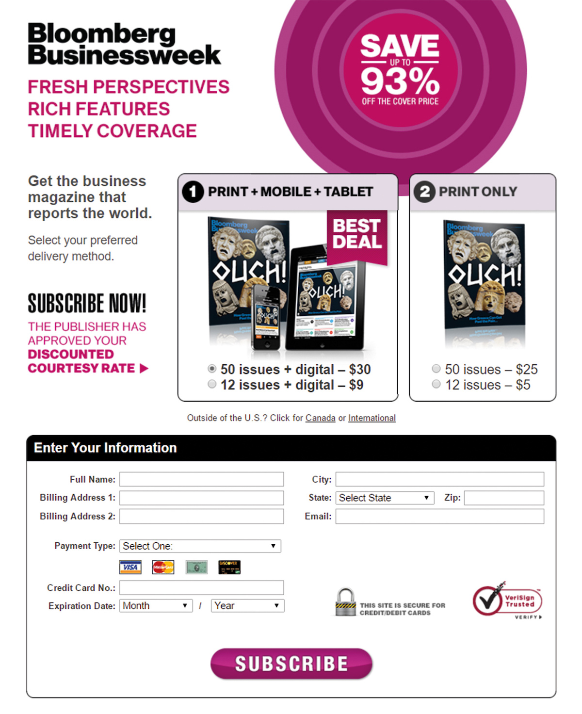
What the page does well:
- A big discount graphic reading, “Save up to 93% off the cover price” immediately draws prospects’ eyes.
- The offer is very valuable — 50 issues AND digital access is only $5 more than 50 issues alone.
- Images of both offers show visitors what they’ll get by converting.
- A “best deal” banner draws visitors’ attention to the offer that gets them the most bang for their buck (also the most expensive offer). Changing the banner to orange, for example, makes it draw more attention as the “best deal.”
- The Verisign security badge lets visitors know their credit card information is safe.
- The large CTA button is easy to find — however, changing the color would make it stand out even more.
What could be A/B tested:
- Lack of visual hierarchy and white space really makes the page look cluttered and messy.
- “The publisher has approved your discounted courtesy rate” is a poor attempt at personalization, because anyone who visits the ad is approved.
- Fine print (below the fold) may make visitors wary, because it makes the company look sneaky.
- Outbound links in the footer could drive visitors off the page before they convert.
3. Spotify

What the page does well:
- Large graphics with minimal copy makes it easy for prospects to see the benefits of subscribing to Spotify Premium.
- The checklist of benefits with each account makes it clear that Premium is a much better option.
- A 30-day free trial makes prospects more likely to purchase the Premium option.
- The Premium CTA button stands out more than the Free one, likely generating many upsells.
What could be A/B tested:
- Outbound links (Spotify logo, header and footer links, etc.) make it easy for visitors to leave the page without learning about the full offer.
4. WOW! TV & Internet
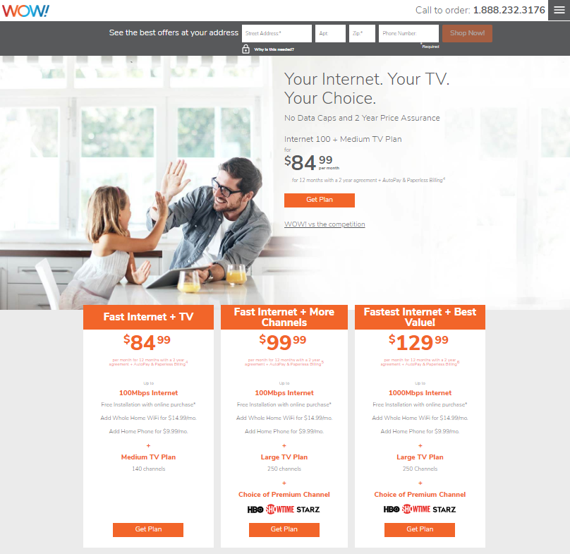
What the page does well:
- The click-to-call phone number enables visitors to easily contact the company.
- A more personalized offer based on geographic location can be provided by inputting an address.
- The lock icon beneath the address fields indicates that prospects’ information is secure, and only used for personalized offers.
- An anchor tag (WOW! vs the competition) makes it easy to navigate the page without having to scroll as much.
- The customer testimonial helps make prospects feel more confident in their decision to purchase WOW! service.
What could be A/B tested:
- Footer links could potentially send people away from this landing page without converting.
- Changing the image so that the people are looking at the package options gives a subtle clue to select a plan. This is known as a visual cue.
Don’t forget to add your business to https://www.top4.com.au/
List your business, create your own digital store to sell goods and services, and share posts on social media. Promote your business on Google instantly! Should you need help with local digital marketing then view our new Google Marketing Platform and services https://packages.top4.com.au/
Get Found On Google Promote Your Website, Reach local customers today!
Source: instapage.com
Related articles :
- Creating Landing Pages That Convert
- The Ultimate Website Conversion Landing Page Blueprint – Free Download
- How to Make the Right Landing Page Rank: A Complete SEO Checklist