If you’re looking to gather leads for your business, you need to have a landing page strategy. Just like every other marketing tactic, this can be done well or it can be done poorly. In order to see the greatest return on their investment, businesses need to build effective landing pages, and then test and optimize them in order to maximize conversion rates. improve their landing page strategy. It will guide you through the entire process of creating and optimizing landing pages, highlighting key points along the way. By the end, you’ll be ready to use Top4 to start creating and optimizing your own landing pages successfully.
What are Landing Pages?
Let’s start the guide by being absolutely clear: your homepage is not a landing page. For that matter, neither is your product page, your pricing page, your contact page, nor even your about page. When we talk about landing pages from a marketing perspective, we are referring only to specific pages that have been expressly designed to achieve a particular goal. Typically, the goal will be to obtain the user’s email address and other personal information. But it could also be to download a PDF, register for a webinar or make a purchase. Whatever the goal is, the landing page should be solely focused on that goal.
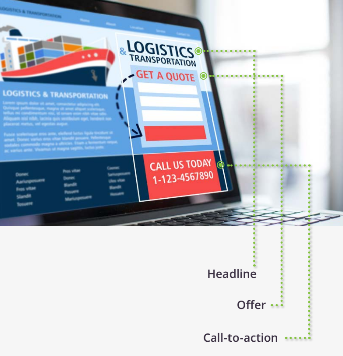
As Tim Ash, CEO of Site Tuner and author of Landing Page optimization, says: “You have to what the desired conversion action is on your landing page.” Landing pages come in all shapes and sizes. They can be extremely simple or incredibly complex depending on the website and the data available. That being said, all landing pages, regardless of ho they are aimed at or what their goal is, will have the following elements:
A Headline
This is the first thing people see and will usually outline exactly what you are offering.
An Offer
You must give users a reason to take action. This is achieved by highlighting what you are offering and how they will benefit from it.
A Call to Action
This is the element that users click to take action. Typically it will be a button, but it could also be a link or a form. And that’s it. Most landing pages will have a few more elements, such as images and trust indicators, but a landing page can be successful using only the three elements above. In fact, keeping the landing page as simple as possible with a single offer leads to better results.
Seven Elements of a High-Converting Landing Page
-
A captivating headline
This is the first and possibly the only thing visitors will read. The headline is where you win or lose them. The key here is to explain the benefit you are offering to users in a single sentence. Don’t talk about features, talk about what they can achieve thanks to your offering. Make it all about the user. You should spend as much time on this single element as you do create the rest of the landing page. Why? Because research has shown that over 90% of users who read your headline will also read your CTA.
-
A kick-ass offer
You could have the best landing page in the world, but if your offer sucks, users aren’t going to be converted. If your goal is to get new subscribers to your blog, you’ll probably want to give away something for free like an in-depth guide to your chosen topic. If you want people to sign up to your webinar, you’ll need to highlight why your webinar is so good. What is the user going to learn from you and how will it benefit them? This will be the second thing users will read, so make sure the copy for your offer follows on nicely from your title.
-
Eye-catching images
Some users won’t bother to read your headline. But if they see an image that they relate to, they may be persuaded to give the landing page a second chance. Don’t just use any old stock image, however. Think of your image as a second headline. Make it powerful; make sure it shows off your product or offering and the benefit to the user if possible.
-
A sweet video
Do you know what’s better than images? Video! If a picture says a thousand words, how many words does a video say? Ten thousand? A million? However many it is, videos are a great way to increase conversion rates. In fact, research from Eye View Digital has shown that using video on landing pages can increase conversions by 86%.
-
Trust indicators
These can be anything from testimonials and reviews to customer logos and Industry certifications. This is an especially important element if the goal of your landing page is to persuade users to buy a product. But even if you’re just trying to get more email sign-ups, it is still a good idea to put trust indicators on your landing page.
-
A clear call-to-action
It’s no good having a landing page if users don’t know what to do on it. This is where your call-to-action (CTA) comes in. “Add to cart” and “Download now” are common calls-to-action should be tailored to your offering and your audience.
-
A post-conversion page
When’s the best time to get a user to convert? When they’ve already converted. This is the goal of a post-conversion landing page. Once they’ve clicked the call-to-action and filled in their information, follow them up with another offer. Maybe this is a product upsell or a request to become a newsletter subscriber. Whatever it is, there’s no better time to strike than while the iron is hot. (Note: Top4 makes this easy with landing page funnels – a series of pages served up in sequence.) If you don’t have an applicable post-conversion offer, consider a thank you instead.
Personalize with Dynamic Contents
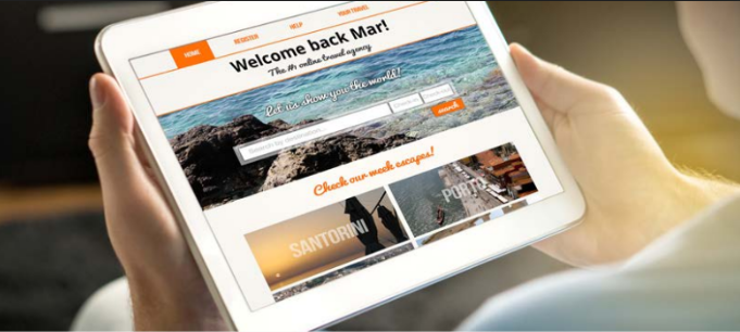
If you’re looking for a sure-fire way to boost conversions, there are few methods better than inserting dynamic content into your landing page. Dynamic content is content that is personalized for a visitor using data you have already gathered about them. According to the Forrester report on Digital Experience Technology And Delivery Priorities, 2016, 68% of marketers and business professionals say that ‘delivering personalized experiences’ is their highest priority for web and mobile initiatives.
Examples of dynamic content
Dynamic content comes in all shapes and forms. Some common examples are:
- Inserting a user’s name into the landing page.
- Switching out imagery to reflect the page visitor.
- Providing upsell recommendations based on a recent purchase.
- Tailoring landing page copy depending on the location of the user.
Key Takeaways
• The best landing pages are designed based on the audience and the end goal.
• A successful landing page is greater than the sum of its parts.
• Images, trust indicators, and videos are great additions to landing pages.
• Personalize with dynamic content to increase conversions.
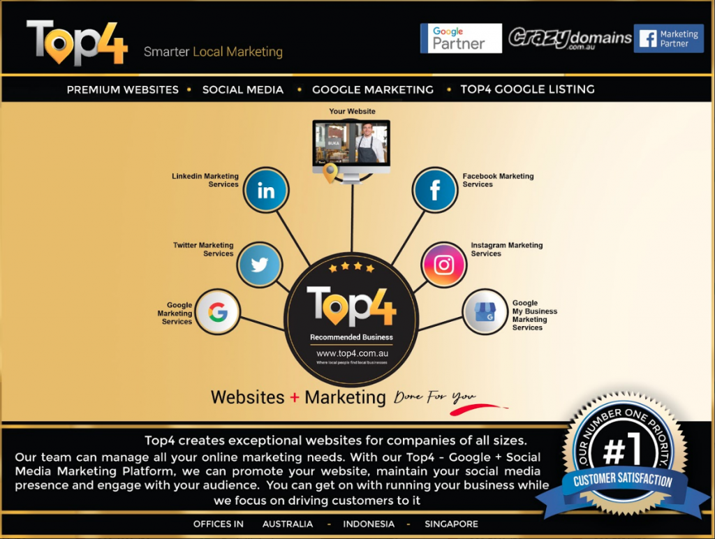
Looking to build customer loyalty through social media? Don’t forget to add your business to Top4.com.au
List your business, create your own digital store to sell goods and services, and share posts on social media. Promote your business on Google instantly! Should you need help with local digital marketing then view our new Google Marketing Platform and services Top4 Marketing
Get Found On Google Promote Your Website, Reach local customers today!
Our Digital Marketing Agency Services Across All Industries Include Search Engine Optimisation (SEO), Google Marketing, Website Design, Corporate Web Development, and local location-based marketing using our own Google Marketing Platform!
Engage A Social Media Agency For Only 1/3 The Cost Of Employing A Social Media Manager…LET’S TALK!


