Creating landing pages that convert. This is your guide to pages that continually capture leads.
If you’re looking to gather leads for your business, you need to have a landing pages strategy. Just like every other marketing tactic, this can be done well or it can be done poorly. In order to see the greatest return on their investment, businesses need to build effective landing pages, and then test and optimize them in order to maximize conversion rates.
This guide is written for any marketer looking to initiate or improve their landing page strategy. It will guide you through the entire process of creating and optimizing landing pages, highlighting key points along the way. By the end, you’ll be ready to use SharpSpring to start creating and optimizing your own landing pages successfully.
Part One
What are landing pages and why are they important?

“You have to have a singular focus and discipline and be very clear about what the desired conversion action is on your landing page” — Tim Ash, author of Landing Page Optimization
What is a landing page?
Let’s start the guide by being absolutely clear: your homepage is not a landing page. For that matter, neither is your product page, your pricing page, your contact page, nor even your about page.
When we talk about landing pages from a marketing perspective, we are referring only to specific pages that have been expressly designed to achieve a particular goal. Typically, the goal will be to obtain the user’s email address and other personal information. But it could also be to download a PDF, register for a webinar or make a purchase.
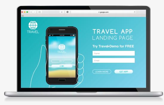
Whatever the goal is, the landing page should be solely focused on that goal. As Tim Ash, CEO of Site Tuner and author of Landing Page Optimization, says: “You have to have a singular focus and discipline and be very clear about what the desired conversion action is on your landing page.”
“Landing pages with multiple offers get 266% fewer leads than single offer pages.” – Wishpond
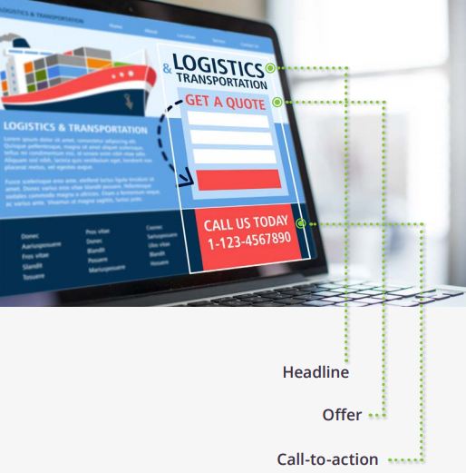
Landing pages come in all shapes and sizes. They can be extremely simple or incredibly complex depending on the website and the data available. That being said, all landing pages, regardless of who they are aimed at or what their goal is, will have the following elements:
A headline
This is the first thing people see and will usually outline exactly what you are offering.
An offer
You must give users a reason to take action. This is achieved by highlighting what you are offering and how they will benefit from it.
A call-to-action
This is the element that users click to take action. Typically it will be a button, but it could also be a link or a form. And that’s it. Most landing pages will have a few more elements, such as images and trust indicators, but a landing page can be successful using only the three elements above. In fact, keeping the landing page as simple as possible with a single offer leads to better results.
Why are landing pages so important?
“The average attention span is 8.25 seconds.” – Statistic Brain
Trying to get a user to take a single, particular action on a standard web page is very difficult. Our attention spans are so small now (they were measured at an average of 8.25 seconds in 2015 and only decreasing as time moves on) that a standard web page simply has too many distractions. Even if a user comes to a web page with a goal in mind, they may get distracted by something in the navigation bar, a link to another part of the website or an advertisement on the page.
The beauty of landing pages is that they limit a visitor’s options to a single choice: whether to opt-in, or not to opt-in. By removing the navigation bar, the sidebar, the footer, and by focusing the design and copy on achieving one single outcome, users are guided towards that outcome. As a result, the decision becomes binary. They either complete the intended action or they exit the page. There is no alternative. When the user completes the action, you get your lead.
Key takeaways:
• A landing page is a distinctive page designed to achieve a specific goal.
• Your homepage is not a landing page.
• All landing pages have a headline, an offer, and a call-to-action.
• Short attention spans mean users are easily distracted.
• Landing pages only give users one option and are therefore more effective at achieving a particular goal.
Part Two
Planning and Creating the Perfect Landing Page
Great landing pages are tailored to their audience.
Planning your landing page
Before you start creating and designing your landing pages, you must first think about who your audience is and what it is that you want to achieve. The answers you come up with will be your guide when it comes to designing your page.
Who is your audience?
Great landing pages are tailored to their audiences. The more personalized a landing page is, the better chance it will have of converting a user. By defining who your audience is, you will better understand how you should be speaking to them, what the page should look like, which devices will be used to access your landing page, and the personal desires of your user.
For instance, if your product is aimed at senior citizens, you might wish to use a larger font size, have a prominent call-to-action that lies above the fold, and write in a style that appeals to them. This landing page would look very different from one designed for a millennial, who would probably access your page on a smartphone and be used to scrolling on a website.
What do you want to achieve?
If you’re using a landing page, the chances are you want to increase your website’s conversion rate. But what is a conversion for your site? Do you need a landing page:
• As a destination for your PPC ad?
• To increase subscribers to your blog or newsletter?
• To let people sign up for your webinar?
• To increase purchase rates of an upsell?
• To create anticipation about a product launch?
• To do something different entirely?
Because a landing page is so specific to the goal that it is trying to achieve, each of these goals will result in a very different looking landing page.
What does a great landing page look like?
The guide touched earlier on the anatomy of a basic landing page, but great landing pages will have a few more elements in order to maximize conversion rates. It’s important to note here that the perfect landing page doesn’t exist. Landing pages can always be improved and there’s no reason not to work at making them better.
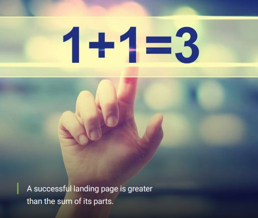
While all of the following elements can help to increase conversion rates, sticking all of them on a page without any thought is a sure-fire way to fail. A successful landing page is greater than the sum of its parts. As mentioned above, the design of a landing page should be influenced by the audience and the end goal.
“Over 90% of visitors who read your headline also read your CTA.” – MarketingExperiments
Seven Elements of a High-Converting Landing Page
1. A captivating headline
This is the first and possibly the only thing visitors will read. The headline is where you win or lose them. The key here is to explain the benefit you are offering to users in a single sentence. Don’t talk about features, talk about what they can achieve thanks to your offering. Make it all about the user. You should spend as much time on this single element as you do creating the rest of the landing page. Why? Because research has shown that over 90% of users who read your headline will also read your CTA.
2. A kick-ass offer
You could have the best landing page in the world, but if your offer sucks, users aren’t going to be converted. If your goal is to get new subscribers to your blog, you’ll probably want to give away something for free like an in-depth guide to your chosen topic. If you want people to sign up to your webinar, you’ll need to highlight why your webinar is so good. What is the user going to learn from you and how will it benefit them? This will be the second thing users will read, so make sure the copy for your offer follows on nicely from your title.
3. Eye-catching images
Some users won’t bother to read your headline. But if they see an image that they relate to, they may be persuaded to | “Over 90% of visitors who read your headline also read your CTA.” – MarketingExperiments GET A DEMO SHARPSPRING GO-TO GUIDE: LANDING PAGES | 12 give the landing page a second chance. Don’t just use any old stock image, however. Think of your image as a second headline. Make it powerful; make sure it shows off your product or offering and the benefit to the user if possible.
“Using video on landing pages can increase conversions by 86%.” – Eye View Digital
4. A sweet video
Do you know what’s better than images? Video! If a picture says a thousand words, how many words does a video say? Ten thousand? A million? However many it is, videos are a great way to increase conversion rates. In fact, research from Eye View Digital has shown that using video on landing pages can increase conversions by 86%.
5. Trust indicators
These can be anything from testimonials and reviews to customer logos and Industry certifications. This is an especially important element if the goal of your landing page is to persuade users to buy a product. But even if you’re just trying to get more email sign ups, it is still a good idea to put trust indicators on your landing page.
6. A clear call-to-action
It’s no good having a landing page if users don’t know what to do on it. This is where your call-to-action (CTA) comes in. It should be clear, prominent and assertive. “Sign up here”, “Add to cart” and “Download now” are common calls-to-action that you will see across the web. As always though, your CTA should be tailored to your offering and your audience.
7. A post-conversion page
When’s the best time to get a user to convert? When they’ve already converted. This is the goal of a post-conversion landing page. Once they’ve clicked the call-to-action and filled in their information, follow them up with another offer. Maybe this is a product upsell or a request to become a newsletter subscriber. Whatever it is, there’s no better time to strike than while the iron is hot. (Note: SharpSpring makes this easy with landing page funnels – a series of pages served up in sequence.) If you don’t have an applicable post-conversion offer, consider a thank you instead.
Personalize with Dynamic Content
If you’re looking for a sure-fire way to boost conversions, there are few methods better than inserting dynamic content into your landing page. Dynamic content is content that is personalized for a visitor using data you have already gathered about them. According to the Forrester report on Digital Experience Technology And Delivery Priorities, 2016, 68% of marketers and business professionals say that ‘delivering personalized experiences’ is their highest priority for web and mobile initiatives.
Dynamic content is content that is personalized to a visitor using data you have already gathered about them.
Examples of dynamic content
Dynamic content comes in all shapes and forms. Some common examples are:
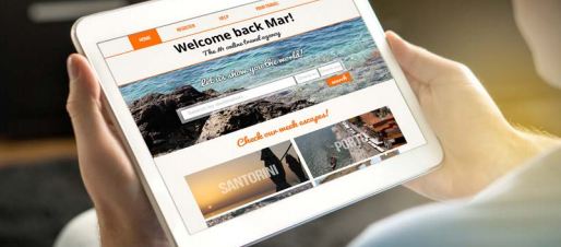
• Inserting a user’s name into the landing page.
• Switching out imagery to reflect the page visitor.
• Providing upsell recommendations based on a recent purchase.
• Tailoring landing page copy depending on the location of the user.
Key takeaways:
• The best landing pages are designed based on the audience and the end goal.
• A successful landing page is greater than the sum of its parts.
• Images, trust indicators and video are great additions to landing pages.
• Personalize with dynamic content to increase conversions.
Part Three
Testing and Optimizing Landing Pages
Landing pages are very rarely as effective as possible right off the bat.
Why test and optimize your landing pages?
If you thought that the work was over once you’ve created your landing page, you’d be sorely mistaken. The truth is, the work has only just begun. That’s because landing pages are very rarely as effective as possible right off the bat. To increase the conversion rate, a program of testing and optimization needs to be in place.
What to test?
That’s an easy one. The short answer is “everything.” If you want to increase the conversion rate of your landing page as much as possible, you’re going to want to test everything you can on the page. You should start by testing the following:
• Headline
• Imagery
• Body copy
• CTA
• CTA color (if it’s a button)
• Background color of the page
• Font size and type
There really isn’t an end date for testing. As long as you have elements to test, you should continue to do so in order to maximize the page’s conversion rate. Even when you think you’ve tested everything, go back and redo tests. Things rarely stay the same, and you may find that your users have changed or the devices they use to access your landing page are different.
“In 2012, Barack Obama’s campaign raised an additional $60 million from a landing page thanks to A/B testing.” – Dan Siroker
How to test and optimize your landing page
When it comes to the method of testing and optimizing your landing page, there are two main approaches: A/B testing and multivariate testing. Luckily, SharpSpring’s platform lets you do both.
A/B testing is also known as split testing. It involves comparing two versions of the same web page where one single element has been changed to see which performs better. For example, you might test a new headline for your landing page. By carrying out an A/B test you would show variant A (the original landing page) to half your audience and variant B (an identical landing page but with a different headline) to the other half. Whichever has a higher conversion rate is the winner. A/B testing can be very effective at increasing conversion rates. Did you know that during his 2012 presidential bid, Barack Obama’s campaign raised an additional $60 million from a landing page thanks to A/B testing?
Multivariate testing involves testing multiple combinations of variables to see which performs the best. For example, you might test a new headline, a new image and a new CTA all at the same time. As a result, users aren’t shown one “In 2012, Barack Obama’s campaign raised an additional $60 million from a landing page thanks to A/B testing.” – Dan Siroker | GET A DEMO SHARPSPRING GO-TO GUIDE: LANDING PAGES | 17 of two options; they might be shown one of eight or one of twelve options instead depending on the number of variables you are testing. Since you can test several variables at once, multivariate testing is much quicker than A/B testing.
If you want to optimize your landing page for SEO, you should focus on writing exceptional, keyword-targeted content.
Which is better?
The answer to this question will depend largely on your website and your timeframe. A/B testing provides excellent, definitive results because only one element is tested at a time. You don’t need a lot of traffic to pull it off, but you do need a lot of time to test every single element using A/B tests.
Multivariate testing can be just as effective and is definitely quicker. However, you will need a substantial amount of traffic to be able to test effectively using the multivariate method. If in doubt, always start by using A/B testing.
Do I need to optimize for SEO?
In a world dominated by Google, every website owner is concerned about their SEO, and rightly so. However, for the most part, it isn’t necessary to optimize your landing pages for SEO. Why? Because a lot of the time you won’t want Google to index your pages. For example, if you have a landing page based around a limited time offer, you don’t want users accessing the page once the offer has expired. You also don’t want users to access a thank you page or an upsell page without going through your marketing funnel. It won’t make sense to them.
That being said, there are certain times where you may want to have SEO traffic directed to your landing page. As with other web pages, it will be important to optimize your title and meta-description. But the most important thing will be your content. If you want to optimize your landing page for SEO, you should focus on writing exceptional, keyword-targeted content.
Driving traffic for tests
Once you’ve decided what you’re going to test and how you’re going to test it, you’ll need to start driving traffic to your landing pages. How you do this will depend on the size of your site and your budget. Below are several ways that business of any size can drive traffic to their landing pages.
Via your website
If your website is already receiving a significant amount of traffic, you can use links throughout your website to direct users to your landing pages. This can be done through CTAs in your website’s sidebar, on product pages or at the bottom of blog pages. This won’t work so well for smaller websites where traffic levels aren’t high.
PPC advertising
This is the most common method of directing traffic to a landing page. Google Adwords is a sensible option, but don’t rule out paid advertisements from social sources such as Facebook or Twitter.
Email marketing
If you already have an email marketing campaign, make sure you are sending readers to your landing pages. These users will usually be familiar with your brand, so bear in mind that conversion rates will probably be higher from these visitors.
Social media
On top of the PPC ads that social media platforms like Facebook and Twitter provide, you can also share links to your landing pages on your social media channels organically and encourage social sharing to drive even more visitors.
Key takeaways:
• Landing pages are rarely as effective as possible without optimization.
• Use A/B testing or multivariate testing to optimize landing pages.
• Test every element on your landing page.
• Drive traffic to your landing pages via your own website, PPC ads, emails, and social media.
Now, go launch your landing page
If you’ve gotten this far, you know everything you need to know to allow you to start creating and optimizing landing pages for your website. SharpSpring makes it easy to get started. With pre-built templates and a drag and drop interface, you won’t even need a designer. Get out there, post a page and start getting leads today.
Don’t forget to add your business to https://www.top4.com.au/
List your business, create your own digital store to sell goods and services, and share posts on social media. Promote your business on Google instantly! Should you need help with local digital marketing then view our new Google Marketing Platform and services https://packages.top4.com.au/
Get Found On Google Promote Your Website, Reach local customers today!
Source: Sharp Spring

