Email is the most important tool B2B marketers have for communicating with their clients and prospects. It allows them to reach their buyers at the scale of their business, and forms a critical part of how marketers create the personalized experience that buyers demand. Integral to both campaigns and 1-to-1 communications, email is a main vehicle for sharing content, product information, and education with your customers.
People send 74 trillion emails per year, and people receive— on average—88 emails per day.
— Radicati Group
Email has been around for more than four decades, and as technology has changed, the nature of email has changed with it. It’s adapting to faster speeds and greater volume, and like all modern methods of communication, email is taking on new forms and becoming more interactive.
The rise of mobile and digital devices like smartwatches and tablets has had a huge impact on the nature of email, and so has the emerging Internet of Things created by the connectivity of these everyday objects. For marketers, which device an email is opened on can have a big impact on how your prospects choose — or don’t choose — to interact with it. Email templates need to be mobile-ready and fit a wider variety of screens and lifestyles than they used to.
We’ve collected some of the most inspiring B2B marketing email templates from a wide variety of industries to showcase the newest trends in email marketing — from structure to content to use case — to highlight what makes each one great and offer some best practices for creating the most successful emails for your campaigns. Along with tips from Email Marketing Manager Nicole Nickerson, we’ll show you how you can implement these trends in your own campaigns.
Emails: Elegran
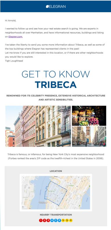
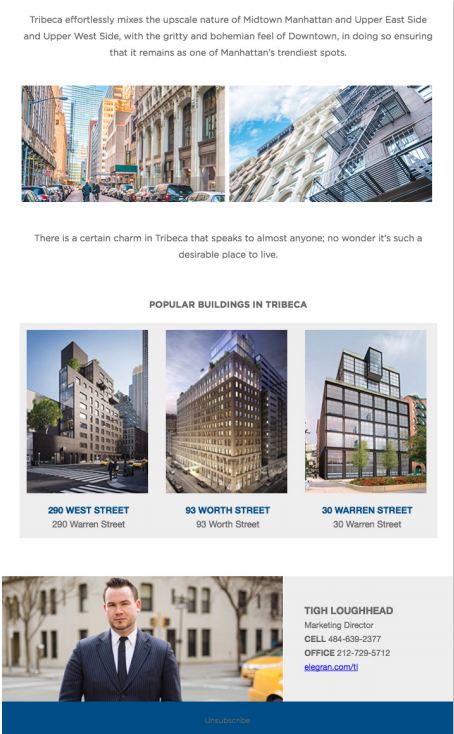
This follow-up email from Elegran demonstrates how a 1-to-1 email can deliver a deeply personalized experience at scale. In this case, Elegran combines a simple text email that includes the recipient’s name, and a custom, thought leadership newsletter that links to content about local landmarks, history, and sights to see in the recipient’s chosen location. It’s a smart, sophisticated way to offer content while still maintaining the details that make this kind of personalization work best.
What makes this email stand out
What makes this template unique is the personalization. Elegran’s clever combination of template styles means that recipients will get an experience that’s been expertly tailored to their needs. Timeliness is everything here, so this is a great way to follow up with customers who have recently engaged with the brand. Prospects who receive this will know that someone’s been paying attention to their personal buyer’s journey, and with content that’s been carefully tailored to their needs, they’re almost guaranteed to click through to view more properties. For marketers wanting to deepen the level of personalization in their emails, Elegran demonstrates how to do it well.
Do it Yourself
At its heart, this template leverages simplicity to ensure that readers aren’t overwhelmed with a thousand CTAs, and also avoids sending any content that isn’t highly relevant. To leverage this kind of personalization in your own templates, you can use variable tags — but having a set of templates designed to engage with your client on a 1-to-1 basis will help ensure that you’re building in the right kind of voice and tone. An email like this works best with a single topic — for Elegran, this is the Tribeca area. That ensures that both your newsletter portion and your personalized introduction are highly topical and timely.
Marketers see an average increase of 20% in sales when using personalized web experiences
— Monetate
A strong uniting theme keeps Elegran’s content finely tuned to its buyers’ preferences — in this case, a particular part of New York City. This is a smart move for a B2B marketer, as it means that instead of filling up a newsletter with a whole host of disparate things, you can concentrate on theming your content carefully around just one topic chosen for its appeal to each of your segments. Use available details about your prospects to help power your personalization. Look through lead records, notes from your sales teams, and any interactions that customers may have had with you at recent events. You can use this kind of content.
This is a great email for driving targeted traffic to the Elegran website. Because of the way recipients can click through to results or other parts of the site, this is a good way to push prospects to your website or other relevant content. Your recipients “self-select” depending on which content they click through to, and you can track that activity and use it to create even more personalized content in the future.
New Feature Announcement: Valpak
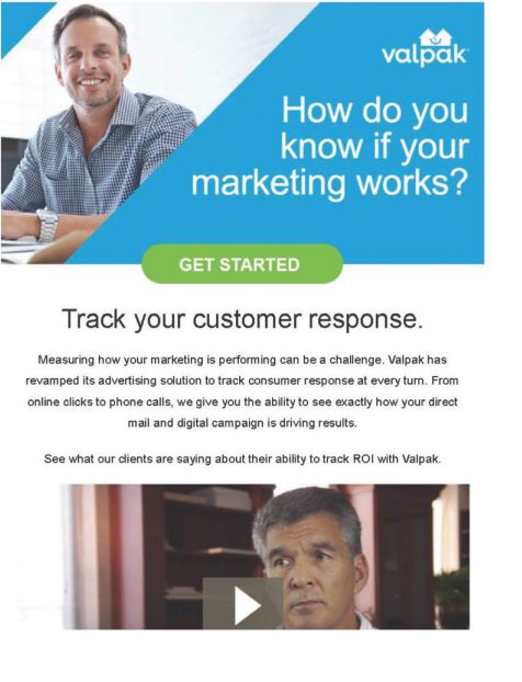
What better way to announce a new feature than with a customer story? This is a great way to leverage existing content to jazz up a new feature email and make it interactive. The video is itself a CTA, which is a smart way to engage your prospects right off the bat. Opening with a question — “How do you know if your marketing works?” — immediately draws the eye, and using the “Get Started” CTA to answer that question is a clever way to encourage prospects to click through to find out more.
What makes this email stand out
Using multimedia like this can be tricky — especially when it comes to video — but the results can be well worth the effort. This template offers more than just your standard fare because of the additional video element, and the bonus is that it’s a customer story. This template from Valpak demonstrates how to use an interactive element in a way that can both surprise and delight prospects.
Do it Yourself
Customer stories or testimonials are powerful, and this is a great way to support the launch of a new feature — especially via email. Think about how to use your customer stories to support your narratives across your email marketing. They won’t fit everywhere, but a good customer story can have a much stronger pull for prospects than other kinds of standalone content.
You don’t have to embed a video (and increase the size of your email exponentially) to leverage more interactive content. Instead, look for smart ways to create engaging CTAs like this by linking to video and interactive content via an image.
Using customer stories this way can really offer recipients more usable content because it makes for such a compelling CTA. They’re also a great resource for email content since they’ve got such a long shelf life.
Sending Thought Leadership Content: Traackr
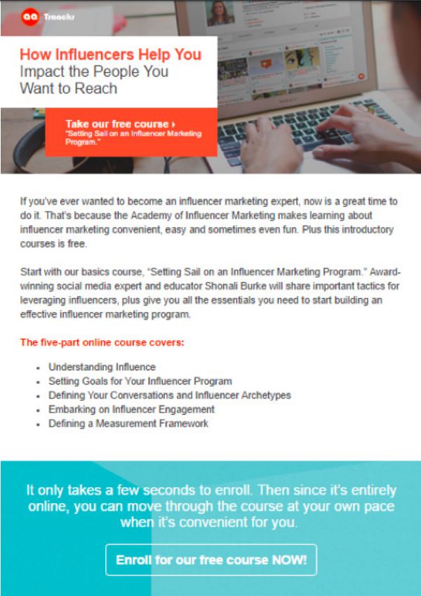
Thought leadership is an undeniably useful type of content for attracting prospects and developing your brand identity. For a robust email marketing campaign, this kind of content provides useful information, best practices, tips, and other helpful items for your target audience and gives them some insight into what your business might be able to offer them — minus the sales pitch. With this email driving to registration for a free online course, Traackr demonstrates how a simple layout can work wonders, and highlights how you can leverage your content to draw in a larger audience.
What makes this email stand out
Traackr cleverly uses two well-placed CTAs to grab a prospect’s attention. The first is in red and highlights that the course is free, while the second catches any prospects who have read to the bottom with a bold call to enroll. The balance of a bold header and a bold footer is a good use of space in a clean, crisp template. It’s also a good example of how to balance a text-heavy email while still maintaining the simplicity of your layout. Brightly colored headers break up the text and draw the eye, and keeping both CTAs against colorful backgrounds ensures that they stand out.
Do it Yourself
Everyone loves getting something for free. Part of the power of this email is the use of the word “free” in both of the CTAs. Even if recipients don’t register, they might still click through — just to see what they’d be getting. If you’re offering free content or doing a special giveaway, don’t shy away from emphasizing this in your CTAs.
One thing Traackr does really well here is provide a quick breakdown of the offer in bullet points. If recipients are skimming the email, they’ll be able to quickly and easily spot what they’re getting and the CTA to get it.
The strong, clear headline with a CTA right at the top makes this template a good one for driving registrations. Without needing to read any further, prospects are able to tell not only what the offer is, but what they need to do to get it. This template is nicely balanced from an aesthetics standpoint as well, with an attention-grabbing header and footer and bold CTAs in both.
Sending an Asset: Macram Digital
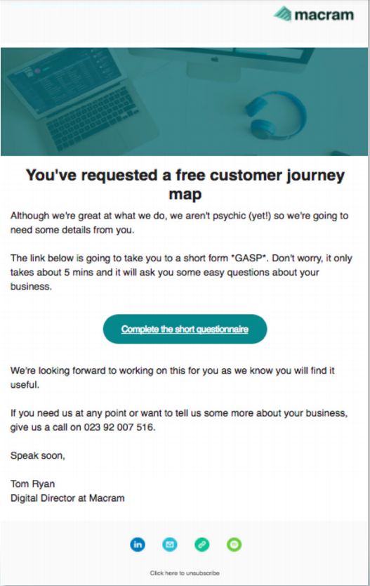
Personalization should be at the heart of your email marketing efforts. B2B marketers know that the demand for a better customer experience drives the need to personalize email content and communications. The question is, how? There are many ways to personalize your emails so they resonate with customers. In this example, Macram Digital is offering to create a personalized asset for the recipient that requires some additional information. The layout is very simple — after all, this email would be a follow-up to previous activity on the website — but Macram Digital succeeds nonetheless in creating a friendly, pressure-free experience for its prospects by offering some great personal touches.
What makes this email stand out
What’s unique about this email is the way that a 1-to-1 experience is woven in. When we download or sign up for assets, we don’t usually get such an individual experience, and that’s what makes this approach so clever. From the nice bold CTA right in the middle, to the friendly tone and engaging copy, it sets out to make a good impression, and by including both a contact number and a name to add a personal touch, it succeeds.
Do it Yourself
Including contact information is a good way to show your prospects that there’s a person on the other end of your emails. It humanizes the experience and can even give prospects a way to cut straight to the sale.
74% of marketers say targeted personalization increases customer engagement.
— Econsultancy
Infuse your personality into your emails at every opportunity. There’s no email too short or too simple that wouldn’t be better for some snappy copy and a personable tone. Email is one of the main methods of communicating with your buyers, and it’s a central part of how they’ll get to know your business. So take every opportunity to ensure that you’re highlighting your uniqueness.
This is a great example of an email asking for more information from a recipient. The copy keeps it from feeling as though the sender is fishing for information, and instead communicates how much Macram cares about creating a better customer experience.
Registration Follow-Up: Columbia Business School
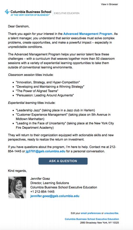
Your prospects have registered for the webinar, course, or summit, and the next communication they receive from you will be a follow-up email that confirms their registration. Follow-up emails aren’t just an opportunity to provide your clients and prospects with more information; they’re also a way to provide a unique customer experience. This email from the Columbia Business School is simple, and offers not only all the information that a course registrant would need but also highlights the value that individuals taking the course will bring to their organizations after completing it. That extra touch tells prospects that Columbia Business School is committed to not only providing the course, but also providing value to its customers.
What makes this email stand out
What makes this text-based template stand out is the CTA “Ask a Question.” Offering recipients the chance to ask whatever questions they might have about their course registration is an excellent way to enhance the customer experience for clients and prospects, and it’s more likely to get them to engage because of its simplicity: Prospects only have to click through to get the answers they need.
Do it Yourself
Think of your follow-up emails as a chance to be helpful to your prospects, and include whatever you can to make sure that they’re satisfied with their registration and have all the information they need to take any next steps. Depending on what they’ve registered for, it may be a good chance to provide additional materials or other supporting content.
Be strategic about the placement of links and CTAs in emails that are primarily text. The Columbia Business School keeps this template from becoming overwhelming by using only a few well-placed links throughout that stand out clearly in the text, and an eye-catching CTA.
Breaking up information in text-based emails is especially important. This is a great example of how to use subtle subheadings to make the content easy to skim without needing bright colors or graphics.
New Product Email: Zapier
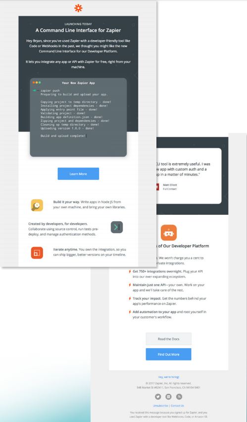
Sending an email promoting a new product to an existing customer is where personalization meets post-sale customer relationships. A report by Demand Metric found that 53% of marketers say ongoing personalized communication with existing customers results in moderate to significant revenue impact. Your existing customers are already educated about your business, but maintaining touchpoints like these will help you continue to develop relationships with them after you’ve closed the deal. This email from Zapier offers information about a new product that is tailored to each level of the sales funnel — from the initial bottom-of-funnel offer, to more middle and top-of-funnel information as you scroll down. This tiered approach gives prospects the ability to self-select their level of interest based on which section’s CTA they choose, and the chance to get more customized information no matter what stage of the funnel they’re in.
What makes this email stand out
One of the unique features of this template is the way the sections are arranged. The copy works seamlessly with the design of the template, and the overlapping squares and patterned layout are designed to keep the recipient scrolling. Because each section offers something different in both CTA and content, prospects who are interested are likely to read right to the end. There’s a CTA each step of the way though, just in case.
Do it Yourself
Don’t be afraid to combine layouts. In this case, it looks like Zapier’s template is part e-newsletter and part new-product promotion, and as prospects scroll downward, they encounter more content in each section, from the initial offer itself to more learning around its platform. Blending email styles this way will give you more options for your content and give your prospects something out of the ordinary.
53% of marketers say ongoing, personalized communication with existing customers results in moderate-to-significant revenue impact.
— DemandGen
The flow of copy in an email is important. When your offer is more informational like this one, the trick is to encourage recipients to keep reading. Thinking about how they should progress to each section when you’re laying out your templates will help you ensure that navigation is clear and accessible, and that the content is structured in such a way that it will make sense to your audience and invite them to keep reading.
This email is long — it reads like an infographic, and both of those are great characteristics. The way that the copy is broken out takes recipients on a journey, moving them through different stages and products and ultimately getting them to the bottom of the page. That’s a difficult thing to do, but Zapier does it well here. One of the greatest marketing myths is that emails should be short, but if you offer content that your audience finds engaging, then longer emails perform just as well as shorter ones.
Monthly Newsletter: Prezi
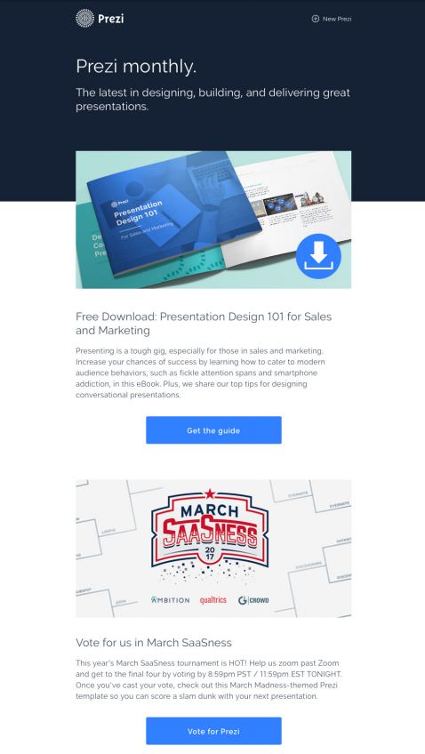
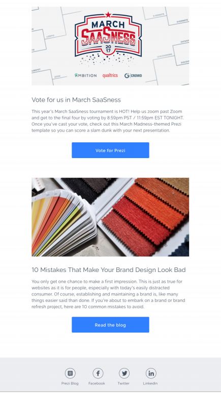
Eighty-three percent of B2B marketers use email newsletters for content marketing (Content Marketing Institute), making these newsletters a staple of most email marketing campaigns, and for good reason. Nothing allows you to connect with your prospects on a regular basis as well as a newsletter. They don’t have to be long, but every piece you choose to include needs to be able to capture your recipients’ attention. This template by Prezi is its monthly e-newsletter, and it combines clean, simple graphic elements with just three pieces of content broken up by clear, concise CTAs.
What makes this email stand out
What makes this template unique is how simple it is. It’s easy to create a busy e-newsletter — full of content and headers and buttons — but a clean layout like this, with fewer graphical elements, is likely to perform better. Cutting through that kind of clutter allows this newsletter to maintain a clear flow of information from top to bottom. The three clear CTAs tell prospects exactly what they’ll be getting if they click through.
Do it Yourself
Don’t be afraid of simple templates. Less can be more, especially when balanced with strong copy and interesting content. A clean well-balanced template can work wonders if you’ve got a lot of content (or a little) to share with your list.
Choose your best-performing content for your e-newsletter. You only have a short amount of time to attract your prospect’s attention, so the content you choose for your newsletter needs to be your most engaging. Spend a little extra time creating effective headlines that will show off your content to its best advantage.
This Prezi template is a great example of how to use images as the focal point of your email — without detracting from your copy or your CTAs. Using the right kind of imagery is the trick to doing this yourself. Opt for high-resolution, good quality images, and then use them to sell the story you’re telling in your copy.
Pros and More Pros of A/B Testing
A critical part of creating a successful email is A/B testing. Little things like the position of CTAs, color scheme, and even the copy itself can make all the difference when it comes to driving engagement. Testing two versions of each email can help you ensure that you’ve found the combination that best resonates with your target audience. The other thing to keep in mind is testing when you have a new piece of content. “Only testing around one asset in your campaign is like taking your audience to an ice cream store for the first time and letting them choose any flavor of vanilla. What if they’d like chocolate better? Testing a selection of different campaign ‘flavors’ and measuring your buyer’s response will give you a much better chance of striking the right balance” (Henry Bruckstein, CEO, Campaign Stars). Software platforms like marketing automation often have native A/B testing features, so the first step to integrating testing into the process of building your campaign is to look for these features. If you’re using a marketing automation platform, you can also track the performance of your campaign and see the path your prospects will take through your campaign based on whether they engage with each email. Having this kind of data on hand gives you the ability to compare the performance of similar past emails and identify other opportunities to either test new templates or reuse successful ones.
You don’t have to test every single element of your email, but if you’re trying out a new type of header or a text CTA rather than a button, for example, then you’ll want to evaluate how those changes affect your audience’s engagement. A good rule of thumb is if you aren’t sure, test it.
In order for A/B testing to offer you the greatest benefit, you’ll need to first identify which elements of your emails you should be testing in the first place. Start by looking at the emails that performed the best. What were some elements included in those templates that are unique? Did you use larger headers? Text or button CTAs? Where was the copy positioned? The offer? Looking for uniqueness will help you identify parts of your design and layout that resonated with your customers and that might have set those emails apart. From there you’ll have a starting point to begin A/B testing those elements in new emails going forward.
Conclusion
Email remains “king” in the B2B marketing industry, with a 4,300% return on investment in the United States (Direct Marketing Association). Being able to create a successful email marketing campaign is critical for communicating effectively with clients and prospects. But when it comes to creating the best email marketing campaigns, it’s the customer experience that needs to be at the heart of the process. From your design to the content you include, aim to offer your buyers something that goes beyond a sale or a product offer to further differentiate your brand. Thinking about what kind of value your buyers will take away from your emails will help you build a campaign that engages and resonates with your target audiences.
Don’t forget to add your business to https://www.top4.com.au/
List your business, create your own digital store to sell goods and services, and share posts on social media. Promote your business on Google instantly! Should you need help with local digital marketing then view our new Google Marketing Platform and services http://www.top4marketing.com.au/pricing/
Get Found On Google Promote Your Website, Reach local customers today!
Source: Social Media Today

